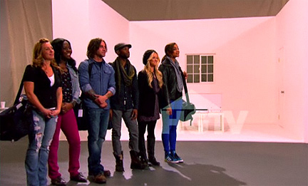
HGTV calls this week’s episode of Design Star “The Ultimate Kitchen Challenge,” but I beg to differ.”Ultimate” implies a showcase experience with lavish details and luxurious, no-holds-barred features. The word “ultimate” immediately sets up the designers for failure. After all, how ultimate can any kitchen be if it’s thrown together in two days? How ultimate is an outdated three-inch backsplash made from countertop material? How ultimate is a tile-free kitchen? If you have mere three-foot stretches of countertop, do you consider that an ultimate kitchen? Let’s just call a spade a spade. This is the Cramped Kitchen Styling Challenge.
I have to say I understand that tile installation has never quite worked out in previous kitchen challenges, but since tile is the breakout of star of any kitchen, its presence is sorely missed. I wish another day or two were added to this challenge to allow for some great tile design. Compensating for this shortfall leads the designers to go a bit generic or they end up on the wackadoo side. It doesn’t help that the designers’ are assigned sinks as inspiration for their designs. Sinks are usually supporting cast.
BRITANY SIMON & DANIELLE COLDING
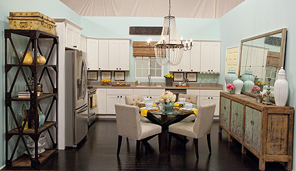
Britany Simon and Danielle Colding create a kitchen inspired by a stainless sink and uber modern faucet.
Obviously, this is the dream team right out of the box and there’s no mystery as to who will win the challenge. When time is called at the end of the two days, there’s still no question that Britany and Danielle are clearly the winners, but only because the other two kitchens are so jacked up. Britany and Danielle, inspired by a contemporary stainless sink and faucet, create a kitchen that is beautifully styled, if a bit generic-looking. The personality of this space is very safe, appeals to the masses, and is very model home-y. While it’s nothing either of them should be embarrassed about, there’s nothing in the room that is inventive or worthy of being featured in a national magazine. It’s perfectly fine but how I yearn for a WOW. Britany’s backsplash frames don’t really add much to the party.
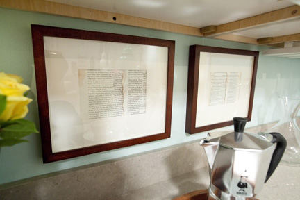
Britany's framed book pages decorate the backsplash.
The detail of the book pages is completely lost on camera, so that element isn’t much to write home about. As for the Kitchen Cousins’ comment about the frames getting ruined by grease from the stove, what’s the big whoop if you have to replace a frame or two down the road?
Both Britany and Danielle do well in their camera challenges. At this point they are the total front-runners for final two.
HILARI YOUNGER & STANLEY PALMIERI
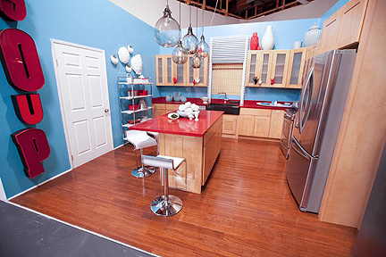
Hilari Younger and Stanley Palmieri go crazy in this kitchen, inspired by a black apron-front sink and minimal faucet.
Oh em gee, all week I’ve wondered who the hell is responsible for this cheap-looking, garish color combo and the outdated cabinetry selection…now we have the answer. While Hilari and Stanley do complete the task and include several interesting elements (red counters, interesting light fixture), their kitchen is a complete loss. I am glad to hear host/mentor David Bromstad bring up color theory, because that’s all I’m screaming in my head when they start rolling out the turquoise wall color. It’s just so unappetizing. There’s a reason why you don’t see this color in food industry branding or packaging palettes. If you struggle with a weight problem, here’s one way to curb your appetite. Beyond the poor selections for the shell of the kitchen, there’s a serious lack of understanding where scale, proportion and editing are concerned. There are so many elements in the kitchen that are the same size, clustered everywhere. There’s an unsophisticated lack of variety in color tones and scale, leaving us with so many things competing for our attention that our visual brains shut down. You can’t see the light fixture because of all of the muck surrounding it. Who cares about an interesting counter choice when it’s combined with colors and finishes that don’t do anything to enhance it? And don’t get me started with Stanley’s window surround and his cheesy, oversized hands as cabinet hardware.
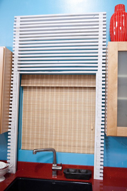
Stanley Palmieri's window surround is a design disconnect.
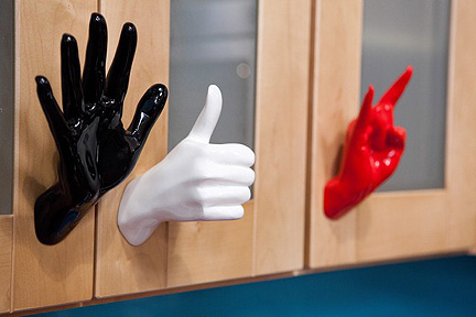
Heyyyyte Stanley's cabinet hardware selection.
The window surround doesn’t relate to anything else in the entire space, and the hands give this kitchen a very Spencer Gifts vibe–cheap and juvenile. Beyond the low taste factor of these hands, they’re just flat out nonfunctional, as they are so large they prevent some doors from opening correctly. I think we’ve all seen vintage letters spelling words on the wall before–especially if you’ve seen anything Novogratz’d–so Hilari’s “SOUP” makes me blerg.
Both Hilari’s and Stanley’s camera challenges are awkward this week–Hilari’s because of her borderline arrogant statements about herself and Stanley’s “what up?” speaking style. I know I’m beating a dead horse by now, but gawd, despite seeming like a very nice guy, Stanley just doesn’t have the “it” factor.
MIKEL WELCH & RACHEL KATE
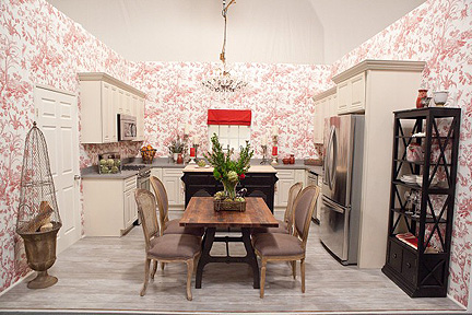
Mikel Welch and Rachel Kate create this kitchen, inspired by an ugly sink assigned to them.
I would never expect HGTV/Kohler to supply the designers with such a fugly sink, and you notice no one acknowledges how much ewww is oozing out of it–can’t diss a sponsor, can we? Onions and chickens and country checks, oh my! What the H, did we somehow flashback to 1979?
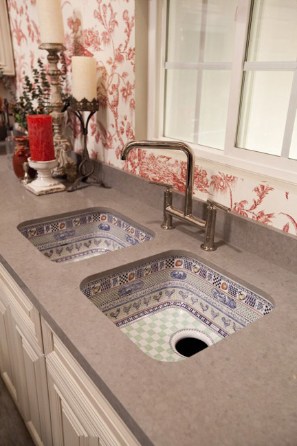
No wonder Kohler no longer displays this ugly sink on their website. Mikel and Rachel add to the ick factor with hurl-worthy accessories and bland countertops.
This kitchen is just one LIFE IS A CHAIR OF BOWLIES Mary Engelbreit kitchen wall plaque short of being the poster child for Midwestern Design Horrors. Mikel can’t seem to help Rachel take the noose off her neck, as hell-bent as she is to hang herself. First, she effs up her wallpaper selection by choosing a pattern that overwhelms the space. The island she selects is a beast that swallows the whole kitchen, leaving no room to open the appliances and crowds the tiny trestle table. The cabinetry, walls and counters are just a bunch of gray mush. On top of that, Rachel and Mikel’s styling is supermisguided. A soaring centerpiece on the table blocks the view of the kitchen behind it (though a favor to my eyeballs, it’s not a smart design decision) and overall, there just isn’t anything of interest on the counters that is bold enough to stand out against the wallpaper.
Mikel succeeds with his camera challenge by referencing his family. “Grandmas are golden,” judge Vern Yip quips. Rachel, on the other hand, is a bit of a disaster. None of her charm comes across, leaving only her nervousness.
At the end of the episode, there are absolutely no other choices for this double elimination other than Rachel and Stanley.
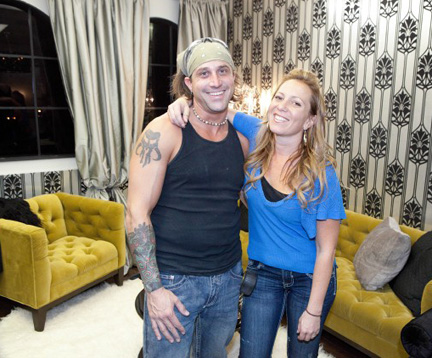
Former teammates Stanley Palmieri and Rachel Kate say goodbye this week.
Phoebe breathes a sigh of relief. “I’m glad Britany is still going to be on Design Star,” my seven-year old comments. “She has the best sense of style. She’s really pretty and sometimes she matches the kitchens.”

Leave A Comment