This week on HGTV’s Design Star: Dougie becomes the new J, Bret still sucks, Kevin’s wall is a total standout, Tyler and Meg do beach chic, Karl gets crafty, Leslie and Kellie are cute, and Mark gets lost. Our on-air pro, Cathy? She gets schooled by Bromstad on how to present design tips on camera. Watching her bristle at his note is priceless. Her mouth says, “Okay, thanks,” but her eyes say, “Who the eff are you? I’m an Emmy-winner, damnit!”
Let’s talk about the good stuff:
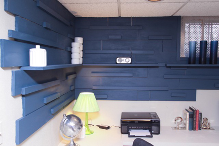
1. Kevin Grace’s multi-dimensional wood wall above the basement desk area.
I love this type of wall treatment every time I see it because it is super sophisticated but is also very easy to DIY. If the shelves jutting out from the wall could be the same thickness as the wood pieces so that the shelves appear to be one of the stacked strips shooting out from the wall, the whole thing would really be genius.
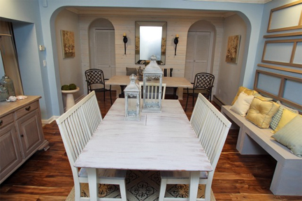
2. Meg Caswell’s and Tyler Wisler’s beach room.
I don’t even do the beach cottage thing but when it’s done right, it’s so damned inviting. This is the best overall room because it looks finished, it draws the viewer in, it immediately puts you at your ease, and looks the farthest from “completed in three days,” as anything we’ve seen on this show. I also appreciate the fact that the stellar points—a whitewashed wood wall and a refinished cabinet—are the result of the designers’ good ol’ fashioned elbow grease and ingenuity, not just their shopping finesse.
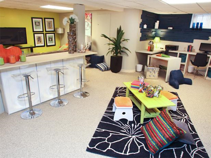
3. Kellie Clements’ awesome cabinetry solution.
The basement features two support poles dividing the space, which are normally difficult to work around. Kellie turns the space between the poles into a bar, transforming an awkward area into a design feature. Considering the way she overcame a similar spatial challenge during the first episode, Kellie’s proving to be a great champion of both form and function.
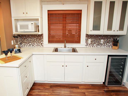
4. Karl Sponholtz’s backsplash.
I have to say, when Karl says he is going to do a broken tile mosaic for the backsplash in his kitchenette, I yawn. When I see the finished product, however, I’m struck by how modern it looks with the cubist gradation effect he achieves.
5. David Bromstad isn’t Cathy Hobbs’ bitch. Even the most seasoned television personalities might feel too intimidated to give a five-time Emmy winner suggestions on how to improve her onscreen persona, but dude doesn’t hold back! Love it.
6. Bob and Cortney Novogratz appearing as guest judges. Did you SEE the episode of Home by Novogratz after Design Star? Epic.
These are officially the only designers I would ever offer up my house to and say, “Do as you wish.” Having them on the judging panel, along with Thom Filicia and the star-studded cast of guest judges HGTV’s bringing out for future episodes, really elevates the show.
7. The carpet manufacturer gets the best free stain-protection demo ever. When Leslie splatters charcoal paint all over the place and then cleans it up with water, aren’t you amazed? If HGTV were smart, they would charge that company a chunk of change to go in during editing and dub something like, “Thank goodness we just installed (insert brand name) carpet. All we need is water and a Brawny® paper towel to get the paint right out!” And there you go—not one but two companies you could strong arm some bank out of. But what does HGTV do instead? They make the finalists drink disgusting swill while flashing their sponsor’s beer labels at the camera. Very Jersey Shore…
This episode’s wreckage:
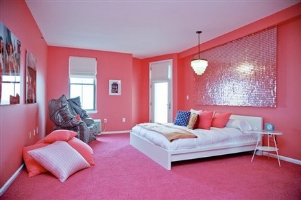
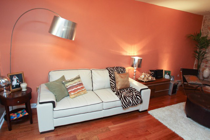
1. The shrimptastrophy that is Doug Hines’ color selection. Ironically, while Dougie’s stubbornly rolling this paint onto the wall to teammate Mark Diaz’s utter horror, Meg and Tyler are eliminating a similar color in their room—because it’s fugly, Dougie.
No matter how many times I hear Genevieve Gorder refer to this shade as “the color of organ meat,” it’s always hilarious.
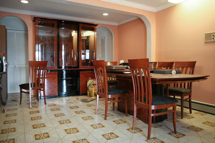
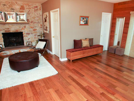
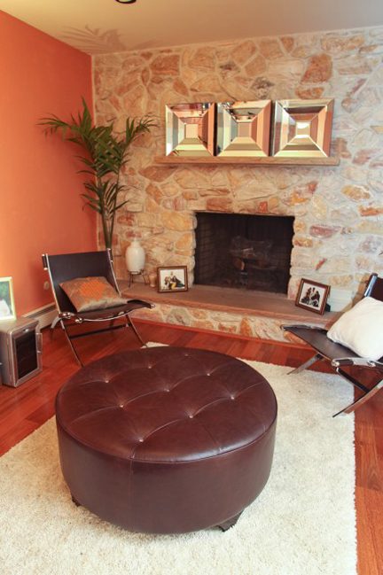
2. The total lack of spaceplanning in Doug and Mark’s room. As if the “organ meat” paint color isn’t enough, the furniture arrangement is pretty pathetic, too. The ottoman in front of the fireplace is too large for the spindly chairs grouped with it, nothing feels conversational, there’s too much furniture crammed into the fireplace area while the former dining space is left empty. Did we just roll up to Ottomans ‘R Us and call it a day? I’ve never seen so many in one space before. There’s the gynormous one eating the living room, the sad one against the brown wall, the two small ones against the left side of the wood wall and another one against the right side. Crazytown.
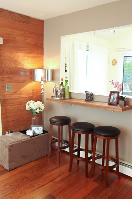
The only part that's halfway decent in Doug and Mark's makeover is the bar. Hard to eff up a bar, but they still managed to overstyle it.
3. Bret Ritter makes a case for permanently being relegated to handyman. No designer worth their salt would put Bret’s miniature, stiff, seating group across from such a casual kitchen. He should be on the chopping block with Dougie. If he wants to play Mr. Fixit, he should be on the DIY network.
4. Mark’s inclusion in the bottom two. When you contribute the only successful element in a room’s design (i.e., his wood wall), you should be safe.
5. Cathyrosa’s behavior toward her teammates. Again.
6. Vern Yip’s appearance on HSN following last night’s DS episode, selling his gawd-awful line of home décor products. Vern, f you can stand there with a straight face and call this merch “beautiful,” I can no longer take anything you say on the judging panel seriously.
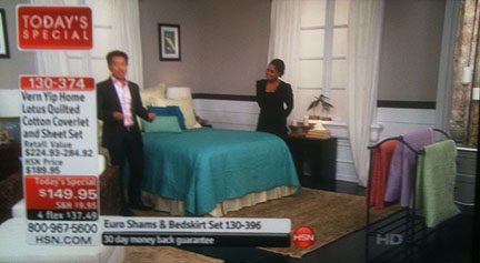
Vern Yip takes pride in his frumpy bedding.
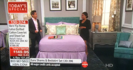
You too can have this frumpy bedding in an array of garish colors.
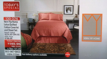
You can even get it in a lovely shade of ORGAN MEAT.
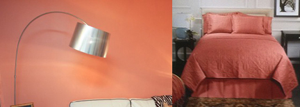
Totally the same color.
All in all, Meg, Tyler, Kevin, Kellie and Leslie create rooms that have a certain WOW factor, and a large part of their success is owed to their ability to work as teams. I’m mystified as to what a contestant is supposed to do with a teammate who is hard to get along with. Let someone steamroll you and you look like a doormat. Go agro and you look like an asshole. Mark achieves a good balance in tonight’s episode and handles a difficult situation like a gentleman. I would pay money to see Vern or Genevieve go head to head in a team challenge with Cathy, J Allen, or Dougie. Cash money.

Leave A Comment