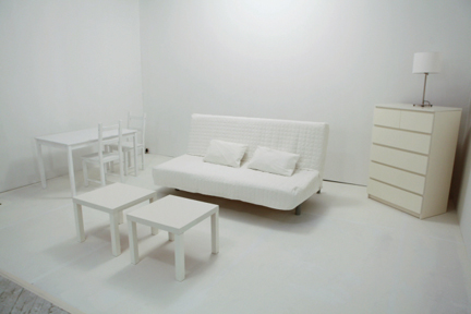
Last night’s episode of HGTV’s Design Star featured the iconic white room challenge. Although this challenge can get a tad tired at times, I love that it presents all of the finalists with an even playing field and the fact that it’s an individual challenge. No one can coast with the benefit of a better partner–each survives based on their own merits. If you don’t know the drill, each designer gets three white walls and an identical set of white Ikea furniture, then they are carted off to a non-home-décor store to purchase supplies to trick out their space. This season the designers have a whopping budget of $1,200 to shop at Restaurant Depot, and they’re told that the rooms do not need to be functional. In previous seasons, the designers were also limited to two gallons of paint…it doesn’t appear that there was a paint restriction this year.
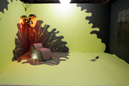
I’ll cut right to it, I thought Tyler Wisler’s room was a shoo-in for the win:
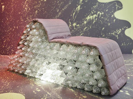
Tyler’s design is true to his portfolio. He eschews all of his supplied furniture in favor of a more minimalist look, featuring a self-made lounge chair created out of luminescent water bottles and draped with his futon’s mattress pad. The most original element of the entire episode, you could conceivably see something like this piece celebrated in a design exhibit at an art museum, like recycled cardboard chairs have in the past. For that alone, I would’ve given Tyler the figurative trophy this week. I also applaud the way his dynamic paint treatment completes his composition and keeps the single lounge chair from feeling lonesome. Great job!
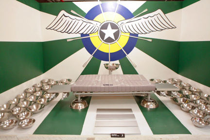
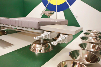
Mark Diaz’ design is 100% high drama:
Mark bases his entire room design around his grandfather’s stint in the Air Force, and that personal passion for the subject matter propels his creation past the remaining competition. The designers who struggle with this challenge don’t have the same well of inspiration to draw from—and it is really obvious. The futon-turned-airplane is an inventive, playful touch. Although the Captain America-ish wall mural is certainly eye-catching, it’s too reminiscent of Antonio Ballatore’s offering during Season 4’s white room episode to win, in my book.

Antonio Ballatore's Season 4 design for the white room challenge.
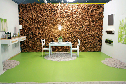
Sneaking up behind Mark is Kevin Grace’s design:
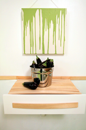
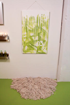
Since Kevin’s a Chicago window dresser, I am most anxious to see what he does for this challenge, and he doesn’t disappoint. While we’ve seen stuff stuck on a wall in these challenges before, this is the most successful use of this type of decorative treatment because it is both cra-cra and restrained all at once. The single color keeps it chic. So totally love the mop head shag rugs, which would be a fun element in reality, not just fantasyland. Love the color palette Kevin selects this week, and am really digging his personality. If Design Star were high school, Kevin would win “Class Clown.”
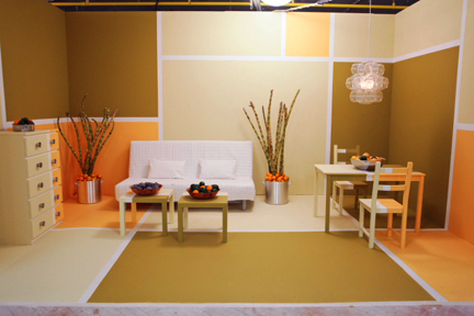
Karl Sponholtz’ design ranks fourth for me:
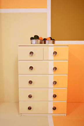
Karl is really crafting some amazing color palettes, although these wonky photos do a poor job of illustrating that. Both this week and last, he’s not depending on current trends, he’s creating combinations that feel different, modern, fresh, and inspiring. As a lover of color, I am a big fan of his work so far. Karl’s white room design certainly looks good, and I appreciate the fact that all of the color blocks and outlines flow right off the wall onto the floor and furniture seamlessly. However, the rigidity of the design and its hyper-controlled feeling are what put Karl into the middle of the pack. While everything looks flawless (didn’t I peg a penchant for perfectionism?!), there’s no zing.
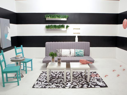
Coming in fifth place is Kellie Clements’ white room:
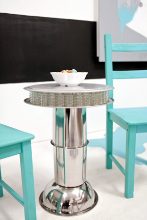
Judging by Kellie’s HGTV portfolio, horizontal stripes on a wall are her go-to design element, so it’s no surprise that we’re seeing them again here. While I do like the effect, if you’re going to do that on a TV design show, your stripes need some extra pizzazz to make them feel current and different from what we’ve seen a thousand times over. Give me some kind of textural element inside the stripes, or some wackadoo color combination that shouldn’t work but does. Aside from that, Kellie’s use of salt shakers to create a crystal-like effect on her side table is so genius.
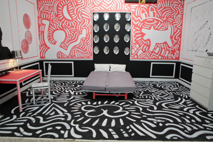
In sixth place, Bret Ritter’s “Martha Stewart Industrial” room design:
I get Bret’s reference to graffiti artists “going bombing,” but this so reminds me of the suitcase on the bed in last week’s episode—don’t invite the judges to tell you that you’ve bombed! The color distribution is cool but there’s not really much to chat about other than the bold graphics on the wall.
Then there are a few rooms that, frankly, aren’t interesting enough to write home about but aren’t lame enough to be sent home for…
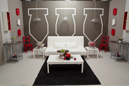
If Doug(ie) Hines used to be a graffiti artist back in the day, I’d much rather see his work on the walls than some homage to Keith Haring:

Nathan Galui's design for Season 4's white room challenge.
Which leaves Meg Caswell and J Allen in the bottom of the pack, for good reason.
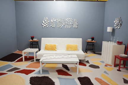
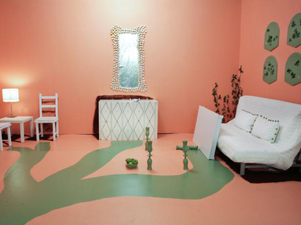
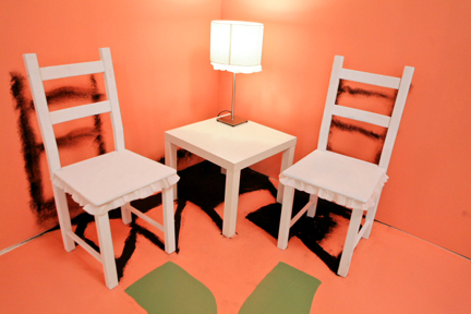
Meg’s color palette is just a total travesty:
The coffee ground shadows Meg creates under the furniture is an awesome touch, and the mop string embellishments on the console are pretty great too, but I agree with guest judge Thom Filicia that Meg’s coffee table is not the only thing broken about the space. Besides the gawd awful color palette, the mirror over the console doesn’t suit the scale of the wall and the chairs in the corner seem awkward in relation to the rest of the room. Overall: no likee. Meg cries in the evaluation room though, so she gets to stay.
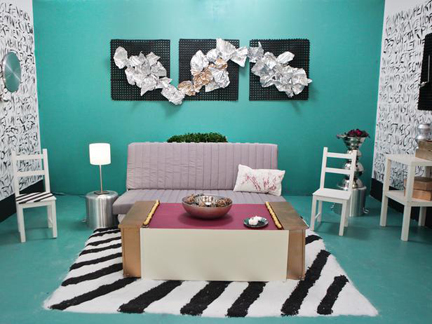
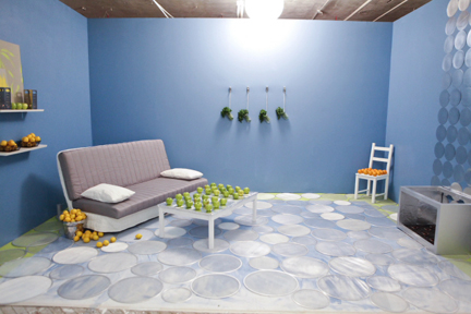
J Allen is sent packing for her fruit stand blue room:
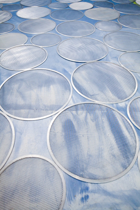
It’s a pretty shade of blue, and I do like the circles on the floor, but J’s fireplace ended up sucking and the rest of her room is completely lame. “I feel like this creative mind is really young,” Thom says when he views J’s space. “It needs to sort of grow.” Considering J’s eleven years as a professional interior designer, this doesn’t seem to be a quality she can really fix at this point. J also flubbed her camera challenge this week, so she’s a natural choice for elimination.
Things I wish someone had done:
– A kitchen
– Stand the futon frame up and weave something through its slats, turning it into a room divider, an exaggerated headboard, or an art piece
– Spent their $1,200 budget—it doesn’t look like anyone even came remotely close
What I wanna know about next week’s episode:
What judge Genevieve Gorder is referring to when she says something is “the color of organ meat.” And Jeb wants to know…which organ?

I like your wish list above.
I thought there were some good solutions this season. Missed the first 15 minutes so didn’t know the full scoop. I really liked Karl’s room. It didn’t have the drama of Mark’s or Tyler’s but I thought it was very well put together. And while I loved Kevin’s paper wall, the rest of the room didn’t seem to be up to par IMO. That wall was so impactful I wanted equal punch in the rest of the space. It seemed like everything was stuck to the walls leaving the middle sadly empty.
And that was a problem with some of the lesser rooms, but in reverse. The inattention to the walls was terrible. Kathy’s mosaic, J’s flowers(?), Meg’s mirror…the contestants that used the wall space boldly had much better rooms. I liked Bret’s room too, but like Karl’s, it was too safe.
Good recap. Looking forward to next week.
Disappointed in this group AGAIN! I honestly don’t like the “it doesn’t have to be functional” part of the challenge. Isn’t that part of GOOD design? Function!? These were all just bad craft projects to me. I’m surprised J went home. Her design wasn’t GOOD, but at least her “main feature” didn’t collapse. I kept yelling to Meg “GLUE! GLUE!”. Chance thought I was asking him to get me some from our office supplies. Lol.
Ugh. Ughhhhly.
Great recap, as usual! I was glad to know what the budget was, but agree that they don’t seem to have used it.
I think Leslie’s black floor mat would have made more impact intact vs in smaller squares. I was really surprised Tyler didn’t win for the fab chair. What were all the bowls on the sides of Mark’s room supposed to be – filler? Kevin’s mop rugs were fun & cute!
Claire – we were shouting “use some glue” @ Meg, too. There seemed to be plenty of glue/epoxy around…
My favorite part was that everyone stood or fell on their own. No one else to take the credit or the blame.
Tied at the top for me were Mark and Tyler but when I looked away the one that came back to my mind’s eye first was Tyler’s.
Where in the world is Cathy going to be next week? In two weeks, she’s managed to turn me off to the Serengeti AND Barcelona. If her passport is current, perhaps she could just go to her next inspiration location instead of being on my tv.
Really liked Kelli’s table.
Kevin’s paper wall was definitely eye catching but my lingering question was, “How does one dust that?” Mop rugs– kept waiting for the Puli trio to stand up and chase something or each other. That “deep shag” was really out-of-the box and made me smile.
Didn’t mind Meg’s colors, just no real substance in the room.
J’s room–substance was all bad. I’ll probably never go down the splatter screen aisle again without cringing.
I won’t be checking out Candice’s blog about the show because she gets to make comments to the other judges / participants and then vote her opinion so don’t see there’s anything else I would need to know. I prefer Clive over the new lady and David Bromstad is everywhere.
Enjoyed your recap–smiled AND laughed.