A couple of episodes ago on The Celebrity Apprentice, both teams were tasked with corporate apartment makeovers. Each identical apartment included a living/dining space, small kitchen, master bedroom, bathroom, and a space dubbed the “celebrity room.” They would have 24 hours to perform their decorating magic, and celebrity designer Jonathan Adler would judge their efforts at the end.
As any episode of MTV Cribs will attest, celebrities haven’t cornered the market on good taste when it comes to home decorating, so the potential for badness was there. How did it shake out?
THE TEAMS
TENACITY
Project Manager: Actress Holly Robinson Peete, who is playing to win money for her autism charity, The HollyRod Foundation.
Support: Musicians Bret Michaels (playing for the American Diabetes Association) and Cyndi Lauper (playing for the True Colors Fund, a charity which promotes awareness on behalf of the lesbian, gay, bisexual and transgender community).

Holly Robinson Peete, Bret Michaels, Cyndi Lauper
ROCK SOLID
Project Manager: Music bizwig Sharon Osbourne, who is playing for Cedars-Sinai in support of the Sharon Osbourne Colon Cancer Program
Support: Celebrity chef Curtis Stone, playing for Feeding America, and pro female wrestler Maria Kanellis, who is playing for the Make-a-Wish Foundation.

Sharon Osbourne, Curtis Stone, Maria Kanellis
LIVING/DINING ROOM: TENACITY
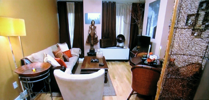
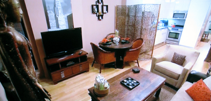
What they were going for: Balinese-style Zen Sanctuary
What they ended up with: A case of the bad brown blahs. Not only are these browns too far off the 80s Southwestern scale, there’s just too much brown. It’s everywhere! I’m desperate for a break from it, and I’m claustrophobic just looking at how much furniture is crammed into the space. Although Bret Michaels’ black and white photography of New York City looks great, the fact that it’s unframed and backed with foam core puts the “corporate” in “corporate apartment.”
How they could’ve saved it: Smaller-scale sofa, eliminate the upholstered chair and use dining chairs for overflow seating. Two dining chairs instead of three. A less bulky coffee table. Some green or blue–something to provide a little relief from the weight of all that brown.
HOLLY: I think these warm earth tones make you feel like a giant hug when you walk in.
ROOM FU: Less like a giant hug and more like an assault.
JONATHAN ADLER: I guess they were trying to create a serene environment, but it felt more cheap than Zen.
LIVING/DINING ROOM: ROCK SOLID
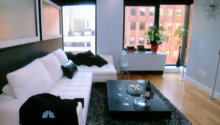
What they were going for: Modern and Clean.
What they ended up with: Success!
What they did right: A minimal layout that delivers loads of seating but doesn’t crowd the space–you can literally walk in and fall into that cloud of a sectional. Keeping the windows free of bulky panels makes Rock Solid’s space feel more open and airy than Tenacity’s living room. Art in the appropriate scale and proportion to the wall–and, ummm, framed–gives Rock Solid’s living room a more finished look. The flower arrangement near the window looks luxe and the wine and treats on the coffee table invite you to relax. Although the color palette is monochromatic, the high levels of contrast keep it from getting boring. (A bistro table and two chairs appear out of the picture frame to the right and provides a dining area.)
What I would’ve changed: I don’t love the ultra-contemporary candlesticks opposite the sectional. They’re too cold and clichè. It would’ve been nice to also have some color or fun in the artwork.
MASTER BEDROOM: TENACITY
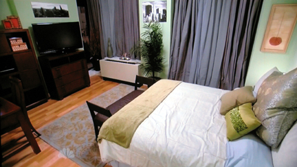
What they were going for: Seafoam Green Sanctuary
What they ended up with: Another crowded space, choc-a-block with furniture. Scale and proportion are out of whack–the rug’s too small and the Euro pillow looks like it’s gonna eat the accent pillows. And seafoam green? Blech.
How they could’ve saved it: There’s too much wood in the space–a mammoth bookcase and a desk in the corner, the TV cabinet, and the bench at the foot of the bed. Eliminating the superfluous stuff in the corner (the dining table in the other room could double as a workspace) would free up room for a comfy chair in the corner that would’ve softened the space.
HOLLY: My mom has (seafoam green) all over her house and I love it! We decided to keep it very minimal—make the color of the walls a star.
ROOM FU: If the color of the walls is the star, it’s a has-been celeb ripe for casting on The Surreal Life.
HOLLY: Jonathan is tremendously talented and he’s a tough critic, but I felt that Jonathan would definitely get the color concept.
JONATHAN: I think on a color level where they really fell down, was that seafoam in the bedroom. That was like, “wha-what?” I don’t know where they came up with that.

Wha-what?
MASTER BEDROOMS: ROCK SOLID
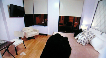
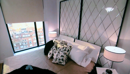
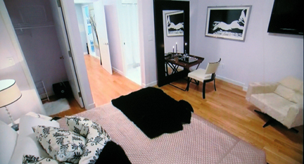
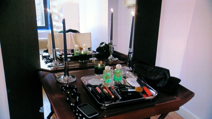
What they were going for: Luxury.
What they ended up with: While this room still needs a little help, it’s infinitely more chic than Tenacity’s master bedroom design.
What they did right: Another minimal approach, Rock Solid only got their frou-frou on with an abundance of bed pillows and vanity accessories. Love the screen backdrop behind the bed.
What I would’ve changed: More color on the walls would’ve made the room feel less drab.
SHARON: The one thing I wanted to do was make it feel expensive by putting in a few luxury items.
ROOM FU: Considering the $100K+ worth of upscale freebies Rock Solid strongarmed out of retailers, you’d better end up with a luxury space.
BATHROOM: TENACITY
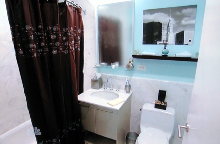
What they ended up with: Oppressive, dark shower curtain that drains the life out of the room. More of their trademark cluttered style.
How they could’ve saved it: They capitalized on contrast in the wrong room. Using that dark shower curtain in such a small space effectively cuts off half the room. If they’d just gone with a thirsty waffle-weave white shower curtain, that would’ve been half the battle. Again, framing the art would’ve made it look more upscale. Far too many accessories in the space–a tiny bathroom like this is a great place to remember “less is more.”
BATHROOM: ROCK SOLID
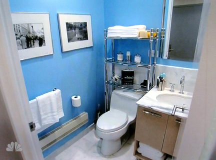
What they ended up with: A Tenacity-type of space. Too cluttered.
How they could’ve saved it: The wall color feels a bit saccharine and needs to be tweaked. The storage unit straddling the toilet looks low-rent. A luggage-rack shelf for towels would’ve been all the storage they needed, and that would’ve been style-appropriate in a bathroom full of Carrera marble.
CELEBRITY ROOM: TENACITY
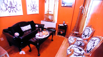

Cyndi Lauper caged a pair of red shoes in Tenacity's Celebrity Room.
What they were going for: Fun and drama.
What they ended up with: Tacky salon à la Lucky Cheng’s. Sure, it’s fun…but yikes, my eyes! That red is just too much, but consistent with their 80’s-era decorating overall. I can appreciate the disco-balls-as-pillows on the patent leather sofa and the feeling that this room could be featured in a music video…I just wish it was right for a current vid and not some 80’s MTV flashback.
HOLLY: We felt like red brings out strong emotions, and red is a very rich and intense color. I loved it—I thought it was a Cyndi explosion!
JONATHAN: Their celebrity room was infinitely more celebrity room-ish. It was really nice to see personality and bold, bold gestures.
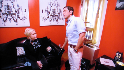
JONATHAN: Patent leather? That resists a lot of the…juices…that come out of the celebrity night.
ROOM FU: Yeah, he really said that.
CELEBRITY ROOM: ROCK SOLID
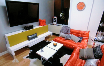
What they were going for: Celeb Media Room
What they ended up with: Well, it’s definitely a media room, for sure. And I do like the pops of color. But I would be hard-pressed to spend anyone’s money on the parachute pants lounge furniture.
SHARON: The celebrity room was a struggle, it really was. It was an afterthought.
JONATHAN: Their celebrity room fell short for me.
KITCHEN: ROCK SOLID
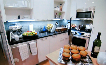
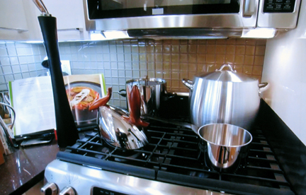
Rock Solid was the only team to trick out their kitchen, thanks to Curtis Stone’s culinary connections. They would’ve achieved a nicer-looking result if they hadn’t crammed cookery and crocks into every nook and cranny. A little restraint would’ve gone a long way.
JUDGING THE JUDGE
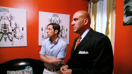
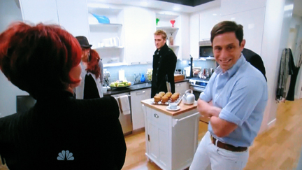
During the course of the judging process, I couldn’t help but notice Jonathan Adler’s body language. Nearly all of the footage of him shows him stranglehold-hugging himself, with both arms crossed tightly to his torso. This suggests a large degree of nervous anxiety–the opposite feeling both teams were going for with their designs. Not much of a ringing endorsement for either space. After all, Jonathan’s a seasoned pro at both critiquing design and appearing on television, so the nervousness has to be a direct result of his underlying feelings about the decor.
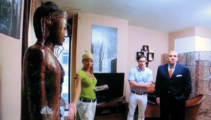
THE WINNERS: ROCK SOLID
Seriously, a no-brainer.
BIG FAILS:
1. Seems a great strategical error that neither team bothered to include any Jonathan Adler merch.
2. Trump’s residential apartment, which is gaud(y) awful:
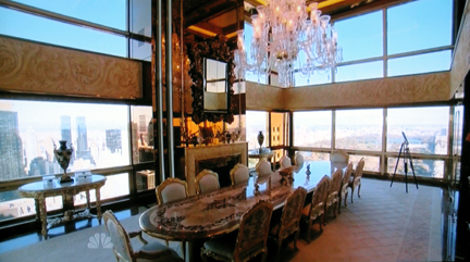
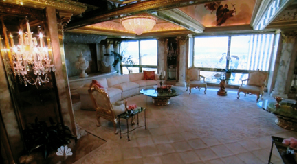
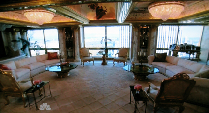
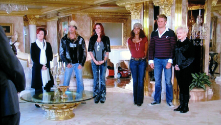
This just screams “cash without class,” does it not? Some guys try to project superiority by driving a hot sports car, and some guys bogart all of the gold leaf, crystal and putti frippery in the tri-state area. Even Maria Kallenis–who isn’t exactly known for exhibiting a sophisticated restraint in the wardrobe department–was agog at the taste-free decor. What I wouldn’t give to makeover that apartment!
