HSTAR7_Kris-Swift-full_s3x4_lg

We continue our Design Star Season 7 finalist profiles with Kris Swift, a Canadian transplant living in here in Austin. Dude looks like he’s sitting on a horse that was airbrushed out of the picture, no? Kris has multiple degrees from the University of Texas (Hook ’em ‘Horns!), so he’ll give our Stanford grad a run for her money on the intellectual playing field. Analyzing Kris via the Interwebs is a very tricky endeavor. On the one hand, we have someone prone to bringing out the superfun in life. For instance…

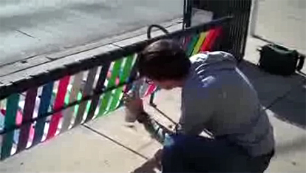
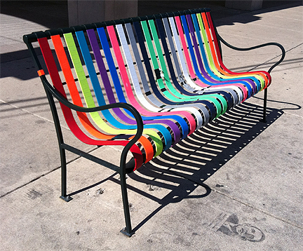
He adopted an Austin Capital Metro bus stop and transformed its bench into functional art–what he called “an urban intervention.”

kris_swift_bus_stop

kris_swift_bus_stop_front

When asked what he thought people would think about his bus stop, Kris replied, “My philosophy is that you don’t tell people what to think. You let them think for themselves.” If you watch the video, Kris doesn’t really elaborate much. Being concise is a good trait for a television host, but he doesn’t seem talkative enough to make it through the presentation challenges of the competition.

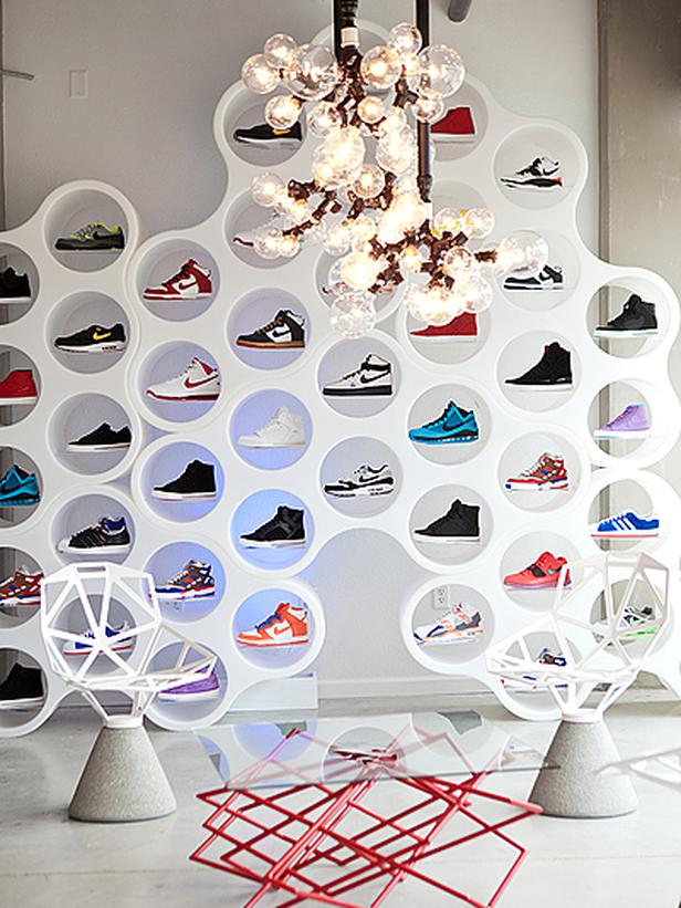
Kris also designed this bubble-icious shoe display for local sport shoe retailer Nice Kicks:

HSTAR7_Kris-Swift-6-Nice-Kicks-Retail_s4x3_lg

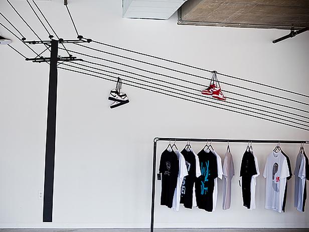
…and cleverly incorporated an otherwise ubiquitous wall sticker into a unique merchandising vignette:

HSTAR7_Kris-Swift-4-Clean-Line-Urban-Retail_s4x3_lg

For the most part, Kris’s portfolio contains great furniture selections and a whole lot of boring white walls with undersized art:

HSTAR7_Kris-Swift-20-Contemporary-Living-Room_s4x3_lg

HSTAR7_Kris-Swift-19-Textural-Residential_s4x3_lg

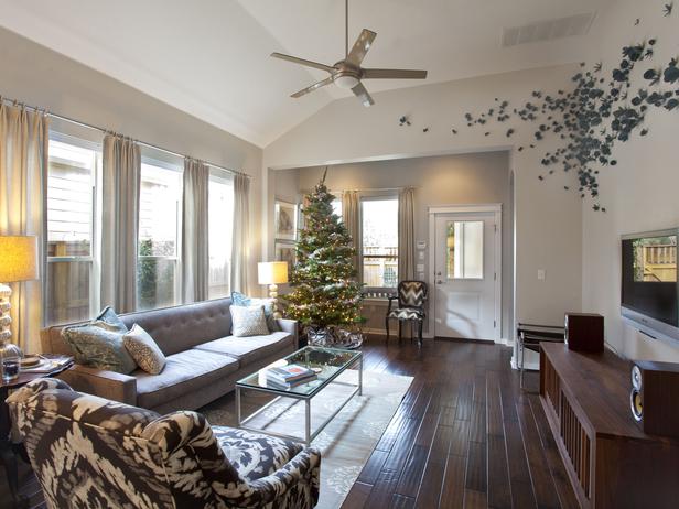
Despite a cool art installation and some subliminal happy coming from the Christmas tree, this space feels cold and depressing.

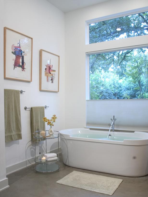
How do you take a beautiful, modern bathtub and make it look incredibly boring and dated? Here's how.

How do you take a beautiful, modern bathtub and make it look incredibly boring and dated? Here's how.

HSTAR7_Kris-Swift-12-Mixing-Old-and-New_s3x4_lg

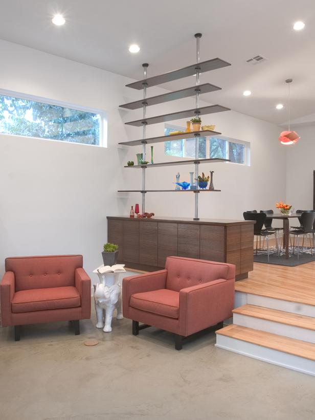
Love the shelving unit/room divider and the chairs, but the chandelier over the dining table is miles too high and the white walls are killing my joy.

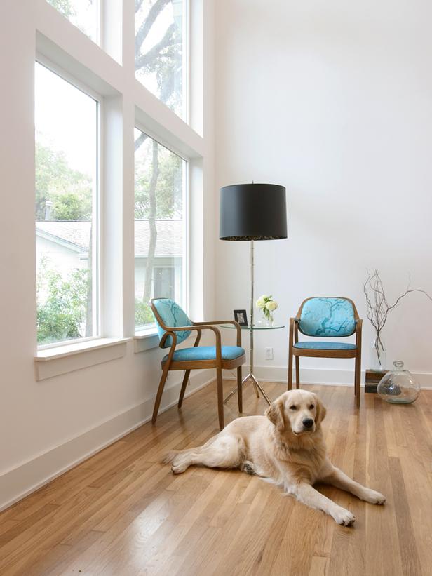
Two chairs, a lamp and a dog do not a portfolio piece make.

Two chairs, a lamp and a dog do not a portfolio piece make.

Cute pieces combined to create a cold space.

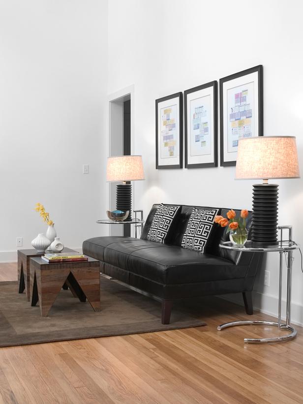
Cute bunching tables, cute pillows, cute lamps, cold space.

HSTAR7_Kris-Swift-3-Classic-Contemporary_s4x3_lg

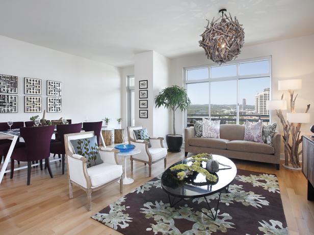
I applaud the chandelier and the eggplant chairs but the rest of this room is soul-crushingly barren, visually.

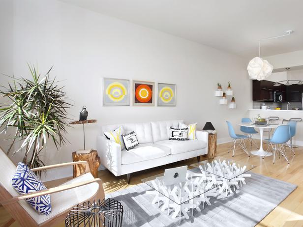
Shrimpy Art Syndrome. One orange square and baby blue chairs can't save this medicinal space. Too bad, because the furniture's damn cute.

Shrimpy Art Syndrome. One orange square and baby blue chairs can't save this medicinal space. Too bad, because the furniture's damn cute and I do love me some Jonathan Adler pillows.

While these spaces aren’t white, they still bore me to tears despite featuring furniture I love:

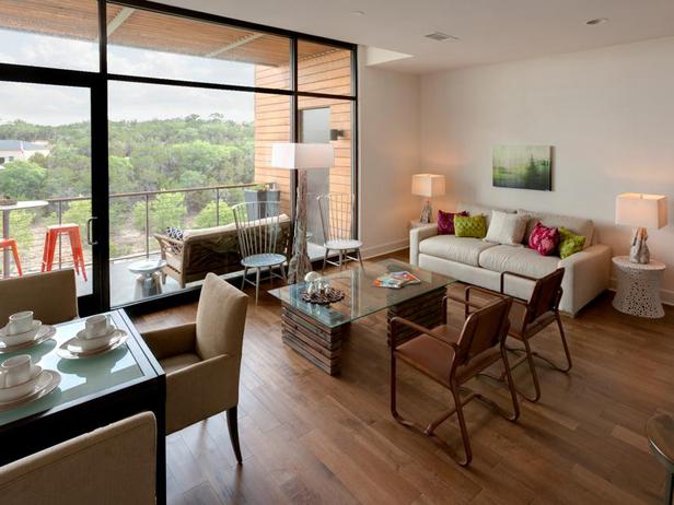
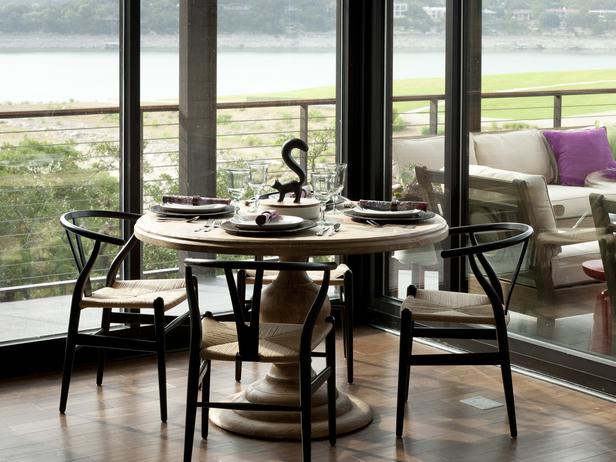
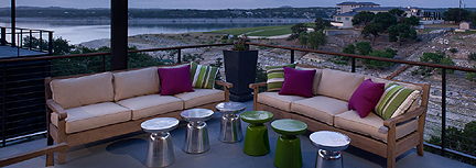
Just because you want to highlight the view doesn't mean you have to sacrifice the interior space to the god of blandness.

Just because you want to highlight the lake view doesn't mean you have to sacrifice the interior space to the god of blandness.

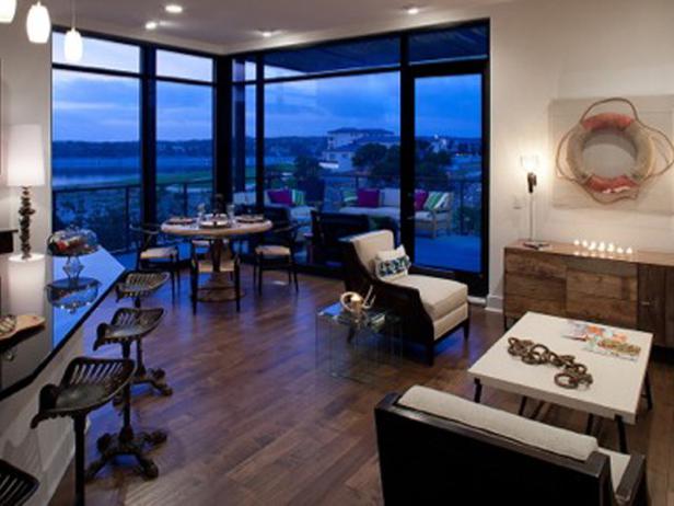
It only gets worse when you pull back and discover the nautical cheesefest elsewhere in the room.

It only gets worse when you pull back and discover the nautical cheesefest elsewhere in the room.

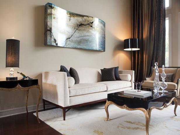
Other impressions? I like this room:

Although this room is overwhelmingly neutral, the dramatic curtains and coffee table help a ton, and the art is finally proportional to the space.

Although this room is overwhelmingly neutral, the dramatic curtains and tables help a ton, and the art is finally proportional to the space.

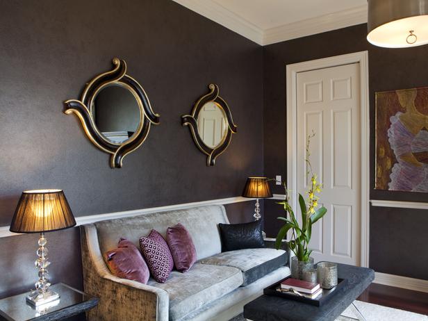
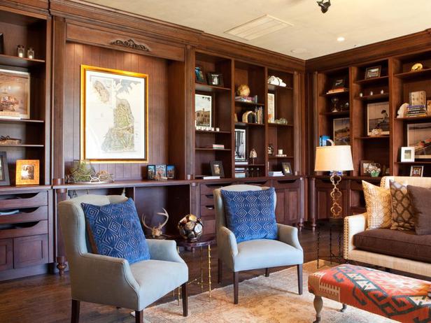
Hate these walls more than words can say.

Hate the dated walls, art, and lamps more than words can say. Love the sofa, ottoman and pillows.

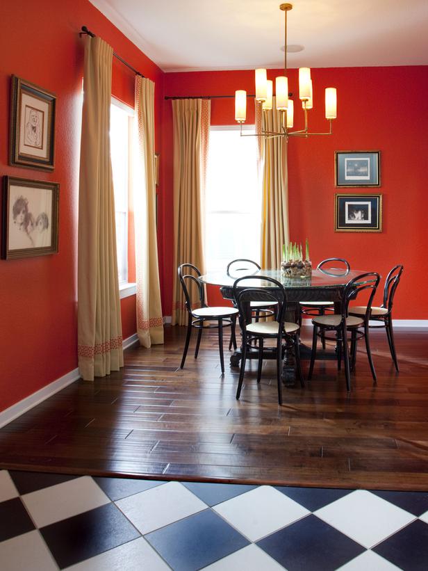
A very dated checkerboard floor and a too-high chandelier. Blerg.

A very dated wall color and checkerboard floor, plus a beautiful chandelier hung too high. Blerg.

Not exactly sure why this is special enough to include in one's portfolio.

Not exactly sure why this is special enough to include in one's portfolio.

Not my thang.

Aside from the floor lamps, not my thang.

These cute pillows are dying in this old man room.

These cute pillows are dying in this old man room.

Holy West Elm martini tables!

Holy West Elm martini tables!

Look, Kris is a hometown guy and I want to dig him. He didn’t completely eff up Texas as some previous Texan finalists have done. I’m just sad that beyond the sneaker store and Kris’s bus stop, I don’t particularly want to spend time in any of the rooms he’s designed. I’m also horrified by the dude’s eponymous website, which is more like a bad college journal than a marketing tool. In fact, it’s an anti-marketing tool, because the shockingly poor design of the entire site is undoubtedly driving business away. He ought to take it down and stick to his biz site, which is infinitely better.

The thing about designing for television is that you have to consistently provide visual interest, and you have to do that in different ways from one episode to the next. You can’t do boring white wall after boring white wall. You can’t depend solely on sophisticated furniture selections because (a) the budget may not always allow for them, and (b) the viewer can only pick up on the broad strokes. Tiny details get lost onscreen, so television designers have to be bold. I’m not seeing a lot of boldness in Kris’s portfolio. In fact, his work is generally quite timid and reserved. Between that, the intellectual blathering on and on throughout his website, and the lack of verbal energy we glimpse in the bus stop video, I don’t think Kris has what it takes to become the next Design Star. Since he’s kickin’ it in the ATX, I hope I’m wrong.

HGTV’s seventh season of Design Star premieres May 29th. Stay tuned to Fu For Thought for another year of episodic critiques throughout the season!