
Thanks to my originally-a-client-now-a-dear-friend Kathryn, I am able to watch last night’s premiere of HGTV’s Design Star Season 5 without fear of blown breakers. And gawd knows I wouldn’t serve myself anything as nice as the Prosecco Royales Kathryn mixes up, either–so double thanks! On my way over to Kathryn’s house, I chat with Season 4 finalist Jason Champion, who is excited to see how things will be different with Mark Burnett’s production company (Survivor, The Apprentice) at the helm. I expect it might be a little bittersweet for all of last season’s finalists to pass the torch to a new set of twelve contenders, but of course Jason is his usual upbeat self and says he expects the show to come off a lot more sophisticated. He is right about that in many respects, although for me, this incarnation of Design Star actually lacks its own true identity apart from The Apprentice. They use the same score, same B-roll of New York City, same confessional interview locations, same pack-your-bags-if-you’re-headed-to-the-“boardroom” as The Apprentice. Regurgitating the formula, music and footage must save them a s### ton of time and money, but if you have the sound turned off, you barely know you’re watching Design Star and not The Apprentice. Granted, this season is head and shoulders slicker than previous seasons, but that bar isn’t so high, is it? Talk about phoning it in…or maybe I expect more from the man who revolutionized reality competition shows?
It must also be said…I miss former host Clive Pearse. He humanized the show in previous seasons and added a humorous vibe that this season is lacking. As a hosting panel, judges Candice Olson (Divine Design), Vern Yip (HGTV’s soon-to-come Urban Oasis), and Genevieve Gorder (Dear Genevieve) appear much more stiff and robotic than they do on their solo shows.
I do applaud the abandoning of Design Your Own Living Quarters So We Don’t Have to Pay Other Designers for That brand of first challenges that has stalked previous seasons. It is interesting to see them begin with the White Room Challenge—something normally reserved for deeper into the season. The fact that the contestants don’t have to bust out of the gate with a group project is great for those of us who are design fans. This gives viewers—as well as the contestants—a chance to size everyone up before everyone’s thrown together on a task and forced to compromise their design visions. (Task? See how Apprentice-speak has already started infiltrating?) It’s also a welcome change to see carpentry assistants assigned to each designer, although I can’t tell if it makes much of a difference in this particular challenge. That will certainly play a bigger role if/when a kitchen makeover is involved.
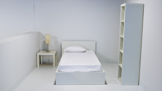
Episode 1: The White Room Challenge
CHALLENGE: White Box Bedroom, inspired by the personal style of a pre-selected fellow competitor
Budget: $500
SHOPPING TIME: One hour
SHOPPING LOCATION: Pearl River (a Chinese American department store)
STACEY COHEN, 35
Chicago, IL
Inspiration: Dan
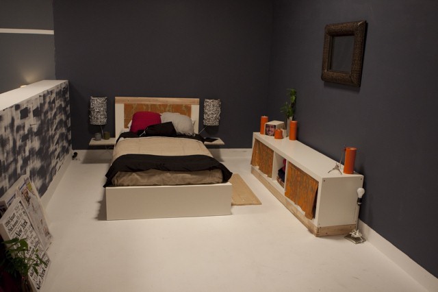
Stacey Cohen's bedroom design, with Dan as inspiration.
Stacey surprises me with her supercool paint roller treatment on her pony wall. From a distance on TV, this inventive paint application gives off the look of a gritty, enlarged, black and white architectural photo that I wish is more prominent. The pony wall seems a weird place to create such a commanding focal point. The rest of Stacey’s room is a throwaway for me, and nothing particularly says “Dan” (described as rustic and into found objects). The third grade collages that are framed & sitting in an unseen corner might speak to the idea of repurposing, but they come off as an amateurish afterthought.
Dan’s verdict on Stacey’s room? “I think she pinned it, as far as my personality and everything.” I will assume Dan knows Dan better than moi, but I’m not seeing how this room really reflects anything Dan-like at all.
DAN FAIRES, 26
Springdale, AR
Inspiration: Stacey
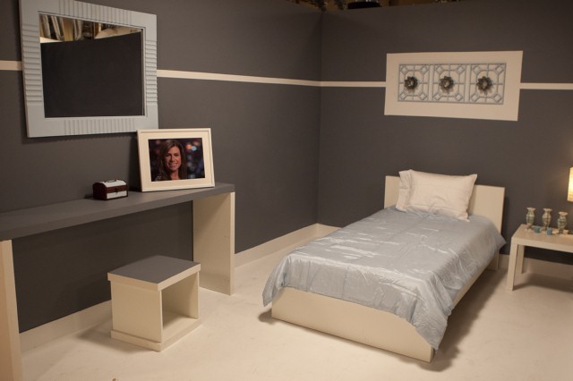
Dan Faires' bedroom design, inspired by Stacey.
I’m sorry, but I found Dan’s room to be horribly boring. There’s a stripe, there’s an object of interest over the bed. Anything else? Not really. Granted, the art piece above the headboard is cute, but it hardly carries the rest of Dan’s drab space.
When asked, “What did you hate about this room?” Stacey replies, “There’s nothing. I love what he did over the bed. It’s a really pretty detail–feminine and sweet.” Yes, yes…but one decent detail in a whole room does not a Design Star make.
NINA FERRER, 31
New York City
Inspiration: Courtland
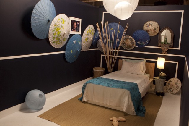
Nina Ferrer's bedroom design, inspired by Courtland. Supposedly.
Apparently, Nina thinks Courtland is a teenage girl, what with all of the parasols she crams into her space. Even gay boys like a wee bit of masculinity in their bedroom décor, don’tcha think? If I take Nina’s supposed inspiration out of the equation, I can appreciate that her design is nicely styled for the budget. As for reflecting Courtland’s personality and style, however, I’d give her space a big zero.
Courtland agrees in one of his confessional interviews, saying, “There was not one thing in that room that I did like, but I tried to do the nice thing (by not expressing that in front of the judges).” Keeping that information to yourself will make your mama proud, Courtland, but it will piss off the judges in a New York minute.
COURTLAND BASCON, 38
Los Angeles, CA
Inspiration: Nina
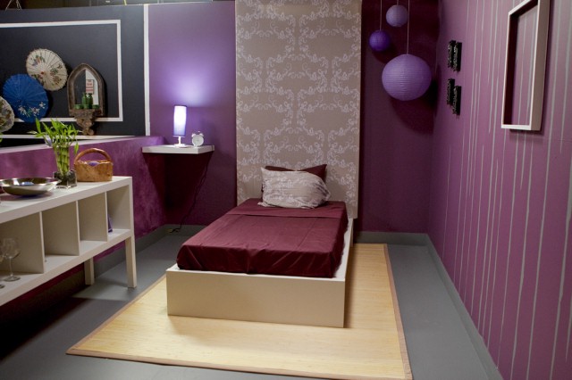
Courtland Bascon's bedroom design, inspired by Nina.
Courtland’s sold a bill of goods by two-faced Nina, who tells him she’s an artist and photographer and gives him the impression she’s into the nightlife. Taking these cues from Nina, Courtland designs a pretty nice little lounge space, with an interesting design on the right-hand wall that reminds me of trendy wallpaper by twenty2. The tall backdrop behind the bed is hip and dramatic, and I dig the cluster of purple lanterns hanging to the right of the bed. There is such a great nightclub vibe to Courtland’s space, it would look right at home in competitor Julie Khuu’s portfolio.
Poor Courtland is blindsided when Nina pops off with, “No, that’s definitely not my style. I’m more bohemian chic,” in front of the judges. My friend Kathryn notices that Nina bites her lip after mentioning this–an obvious giveaway that she knows she’s sticking it to Courtland and is wondering if he’ll be a good little boy and keep his trap shut. What does Courtland do? He awkwardly shifts his eyes from the floor to the judges and plays right into her hands.
Altogether now: Poor Courtland.
TOM VECCHIONE, 46
New York City
Inspiration: Julie
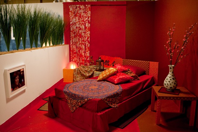
Tom Vecchione's bedroom design, inspired by Julie.
Crazy Tom Vecchione is wearing pin-striped suiting to paint his room in! Could the producers not give these people two minutes to put on some paint-worthy attire? Must these people work for free and ruin their wardrobes?
Although Julie describes her style as “modern, global glamour,” and specifically points out that this does not necessarily mean “Asian,” the room Tom designs for her comes off as Early Asian Brothel. The bedside table’s red, the headboard’s red, the walls are red, the bedding is red. In such a room, I would expect a tip jar on the nightstand.
Julie says of the space, “I feel like it’s dynamic enough. It looks like a place I would invite my friends into, and we would sit back and relax.” Doubtful.
JULIE KHUU, 29
Santa Ana, CA
Inspiration: Tom
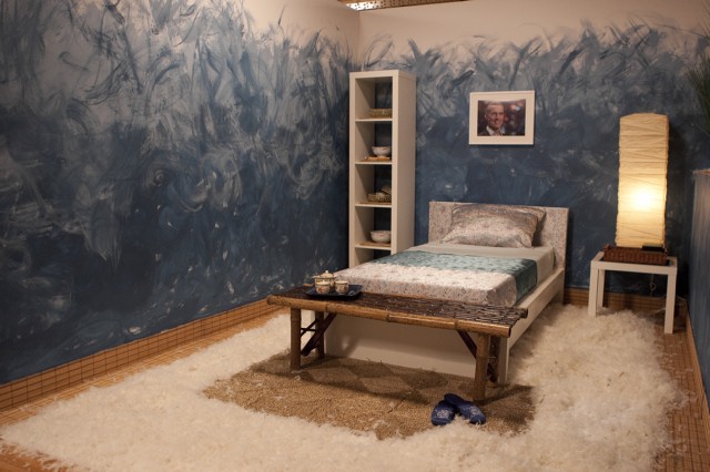
Julie Khuu's bedroom design, inspired by Tom.
I don’t know where Julie is going with this room, but it’s not the feng shui thrill ride she’s trying to pass it off as. This room beats out Nina’s design for Least Likely to Suit Inspirational Subject. It’s the white room challenge, so cue someone creating conceptual flooring out of some weird material, à la David Bromstad, and that someone this season is Julie. I don’t know why anyone thinks they’re being original with that move. Besides, why the conceptual rug when you actually incorporate a real rug into the mix? Worse yet, why go to the trouble of covering the floor and baseboards with woven bamboo mats if you’re just going to wreck that one detail you got right by smothering it with all of those feathers? The bedding selection is less Tom Vecchione (who tells the judges he’s into heavier gauge fabrics and flannels) and more Beijing Pajamas. Nina thinks Julie’s room “was kind of like, ‘I’m-16-years-old!’ kind of bedroom.” Hello black kettle? Pot calling.
ALEX SANCHEZ, 26
Upper Marlboro, MD
Inspiration: Casey
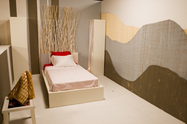
Alex Sanchez' bedroom design, inspired by Casey.
Although a pile of materials Alex selects at Pear River don’t make it with him to the checkout line, I vote for this being a good thing. Most of the items left behind are full of distracting reds that might overwhelm his otherwise soothing color palette. I dig the simplicity of his layered bamboo wall treatment on the right-hand side of the room, love the twiggy headboard he creates, and think the asymmetrical vertical stripes on the walls are cool, but these elements don’t all belong in the same space. Alex could stand to do some editing, and the first thing to go should be his red sheets. Everyone has to incorporate their subject’s photo into their designs and Alex is the only one to do this in an inventive way, using his framed photo of Casey as a tabletop instead of hanging it on the wall or setting it on a shelf.
Casey “wish(ed) he’d been able to do something with the floor…it looks a little unfinished.” That’s a bit of a reach, if you ask me. It reads “minimal,” not “unfinished.” With all of the crap going on with the walls and headboard, your eye needs that place of rest.
CASEY NOBLE, 32
Redondo Beach, CA
Inspiration: Alex
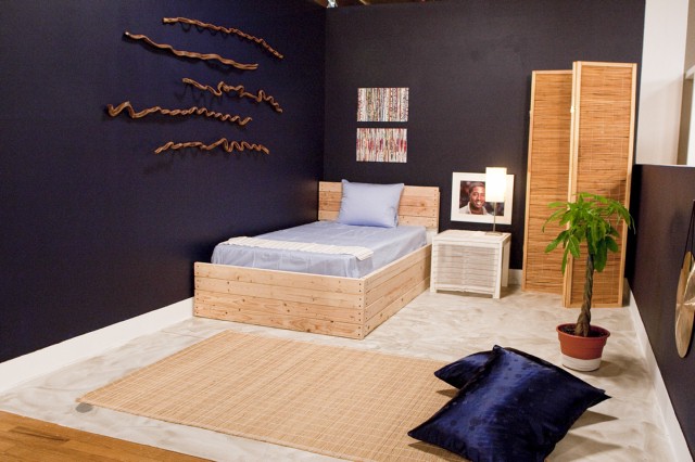
Casey Noble's bedroom design, inspired by Alex.
Love, love, love the wood wall art on the left-hand wall. That is one of the best installations in the whole challenge. Wrapping the bland Ikea bed with wood is a nice touch. I like Casey’s room compositionally.
TERA HAMPTON, 41
Austin, TX
Inspiration: Trent
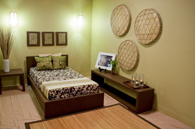
Tera Hampton's bedroom design, inspired by Trent.
After seeing Tera’s portfolio, I am relieved to like the room she designs for Trent. I really do want to root for the home girl! Her combination of fabrics is nice and the overall look of the space definitely seems to fit the bill for a self-described travel junkie. I don’t quite understand the sheets covering the floor but at least they’re not very noticeable. There’s nothing particularly inventive about Tera’s space, but it’s definitely well put together.
TRENT HULTGREN, 41
Venice, CA
Inspiration: Tera
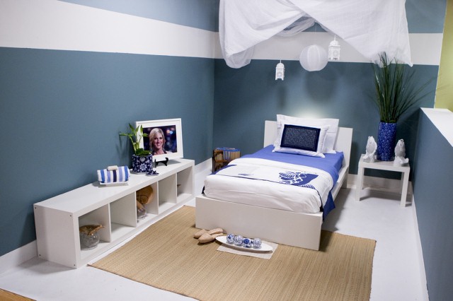
Trent Hultgren's bedroom design, inspired by Tera.
I’m not surprised to see Trent incorporate the nicest bed coverings out of all of the designers—he does his best to pull off the plush, comfy look his portfolio is chock full of. I am disappointed that some of his accessories don’t pop against his wall color and that his canopy is hung haphazardly over the head of the bed, but when Tera says she thinks there are too many tschotchkes in the space, I couldn’t disagree more. It’s not as heavy-handed as she makes it out to be.
MICHAEL MOELLER, 30
New York City
Inspiration: Emily
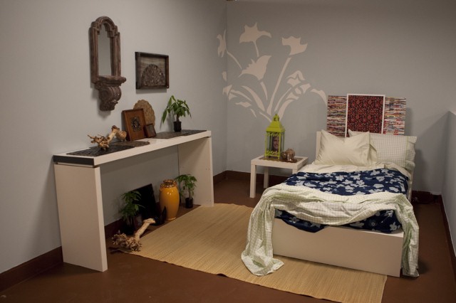
Michael Moeller's bedroom design, inspired by Emily.
Michael starts out by painting (Season 2 winner) Jennifer Bertrand-style graphics on the wall, but then F’s it up by making the flowers too frilly for the Portland kind of girl that Emily is. Leaving the bed unmade is a fun nod to Emily’s personal bed-making habits. I’m not a fan of the “art” leaning against the wall on top of the headboard. It screams “placeholder.” Michael’s space is suffering from an identity crisis—cartoonish and girly on the back wall and the bed, sophisticated stylist on the left-hand wall. Michael’s the only one to do anything interesting with his rug placement, sad to say.
EMILY HENDERSON, 30
Los Angeles, CA
Inspiration: Michael
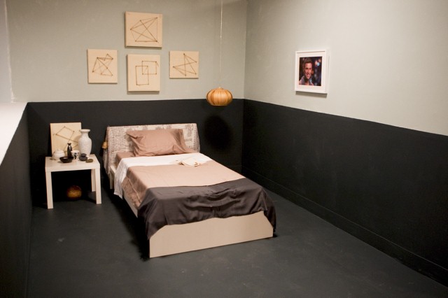
Emily Henderson's bedroom design, inspired by Michael.
I love Emily’s room more than everyone else seems to (including Emily) and feel vindicated to see another designer with a penchant for staring at her work–something that is very much a part of my own process as a designer. (How else can you gain energy from successful elements and pinpoint the areas that still need work?) The artwork Emily creates from canvas, nails and twine is actually reminiscent of some of the work in Michael’s portfolio, so that scores points in my book. Her pendant next to the bed could go into production tomorrow and sell like hotcakes. The way Emily uses the dark paint on the lower half of the walls and across the floor makes her pony wall look like an intentional design feature instead of something she got stuck with. As far as I’m concerned, the only element her space could use is a monochromatic rug with loads of texture. Her space is minimal, sure. Very Dwell, if you ask me. Makes me wonder…what would the caption read if you saw Emily’s room on Unhappy Hipsters? (Post your captions in the comments below!)
In a very Next Food Network Star (similar show on HGTV’s sister network) twist, the judges name their top six rooms and their bottom six rooms. Those in the bottom are required to create a video walkthrough of their space, to help the judges determine who should be eliminated.
TOP 6: Stacey, Tera, Nina, Casey, Michael, and Dan
OVERALL WINNER: Nina
BOTTOM 6: Courtland, Alex, Trent, Emily, Tom, Julie
My “Top 6” list would’ve included: Casey, Emily, Courtland, Tera, Michael, and Stacey.
Nina invents a new style persona so the judges will judge Courtland harshly, and designs a room fit for PB Teen instead of a 38-year old man, and she’s picked as the winner? I’m just not getting it. I’m tired of reality competition show judges penalizing people like Courtland, who chooses to remain a nice guy instead of calling his competitor out for being a lying liar on the first challenge. Why must we reward bad behavior time and time again? Oh, right. Because the TV industry thinks that villains make for better TV—when actually, the reverse is true. So Courtland’s not an asshole—that’s a bad thing??
And Dan? Top 6?? My friend Kathryn asks me, “Does Dan’s room look good compared to Emily’s room?” To which I say, Hell to the No. Not even close.
Casey whines about Alex’s “unfinished” floor. “I don’t think my personality was showcased in Alex’s room,” she says. “Am I unfinished?” Seems like a comment that is bitchy for bitch’s sake. Is Alex the tiny little tree you left to the side of your design, Casey? Then why take such offense over his dumb floor?
In a nutshell, Vern tells Trent, “This isn’t Shopping Star,” and complains that “nothing (in his room has) been reinvented.” Which is a comment that would also apply to Tera, Nina, Tom, and Julie, would it not? And yet Nina wins and Tera (rightfully) makes Top 6. We’ll assume Vern made the same criticism across the board and it was just edited out.
Vern saves his harshest (yet funniest) criticism for Emily’s room. “It’s just so underwhelming. Looks like a prison cell for a monk, and he’s taken some loose threads from his garment and created art with it.” Ha! Maybe so, but I would rather spend a week in Emily’s room than a day in Dan’s.
UP FOR ELIMINATION: Emily and Julie
The judges decide Emily and Julie have the worst rooms. Julie is rightfully in the bottom, but the only reason Emily might deserve being up for elimination is the fact that she throws her own self under the bus in front of the judges. Don’t hand your head to the judges on a silver platter, Emily. Nina will do that for you in a later episode. Instead of Emily, I would’ve put Dan in the bottom two. His room is no more fleshed out than Emily’s, but it lacks the contemplative quality Emily’s room has. Would you be the slightest bit curious about Dan’s inspirational subject? I wouldn’t. Emily’s space, on the other hand, has more editorial meat on its bones.
Emily’s and Julie’s video presentations are a study in contrasts. Julie’s is cheesy and canned—very Design on a Dime. She’s selling it big, I’ll give her that. What is it she says? ”Welcome to Khuu Rooms?” Kinda funny. “Turning a space from ‘boo like that’ to ‘Khuu like that?'” Ouch, my ears.
Emily’s video is a complete listing of everything she does wrong in the space. She sort of turns it into a positive by pointing out things she would do differently, but we don’t need to know she plays it safe with the pendant light…when we like the pendant light.
Vern tells Julie that nothing in her video seems genuine or from the heart. “Everything seems scripted,” so she’s the first to go home. Like every other contestant eliminated on The Apprentice, she’s shown rolling her little bag out the door. Bye Julie. At least she’s not thrown into the old Design Star Elevator Cage of Doom. Glad to see we’re rid of that and the awful “Your Show has been Cancelled” elimination phraseology.
I personally would have sent Dan packing. Even with that great smile.
Next up: Julie Khuu dishes on who should’ve gone home instead of her, and whether or not Nina deliberately set Courtland up!
