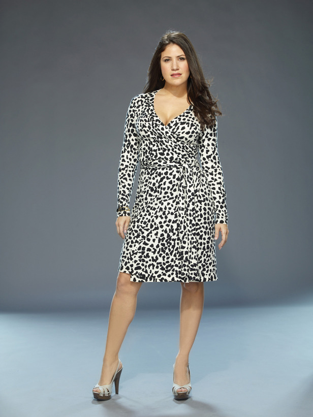
The debut of this year’s season of HGTV’s Design Star is less than three weeks away, and normally I would have already checked out the finalists in detail, made my predictions for the season, etc., etc. But with last season’s succession of sucky challenge after sucky challenge and sucky mural after sucky mural, combined with this year’s explosion of business on my personal homefront, I just haven’t had the inclination to devote a lot of time to it. Still, I’m incredibly curious, so to tackle it between now and July 19th, I’ll just take it one finalist at a time. Today’s victim finalist is Jersey girl, Blanche Garcia:
Blanche is a practicing interior designer in Montclair, NJ, who defines her style as “Green Glam.” Her work:
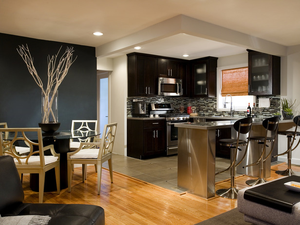
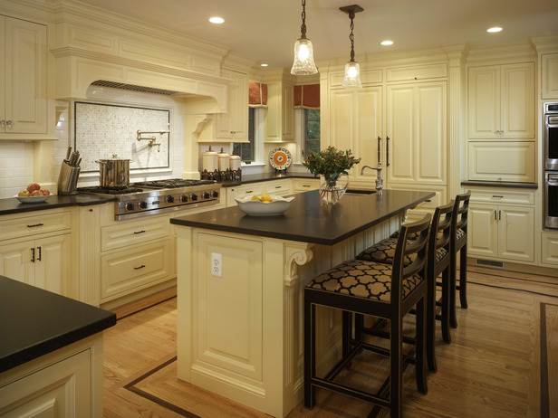
This is the first photo I saw of Blanche’s work, and it was a pretty good place to start. Both the kitchen and adjacent dining room look clean, sleek, modern, and sophisticated. I would’ve rather seen nice art on the wall behind the dining table rather than sticks in a vase, but no biggie.
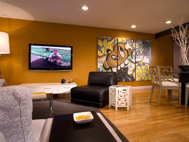
Unfortunately, it’s apparent that this bachelor’s inner child comes out in Blanche’s design for his living room. This room looks more like a playroom than a sophisticated guy’s hangout space. It’s not the art that makes things seem juvenille…it’s the combination of that particular art and that particular wall color and all of the white furniture that sort of screams Romper Room. The unity that made the kitchen and dining room relate to each other well is completely missing in this attached living room. Everything has more of a hodge-podge feeling to it. I like most of the individual elements…I just don’t necessarily dig them all together.
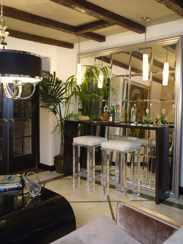
Again, I just want to simplify this space. I can appreciate the gorgeous barstools and the lighting selections, but it feels visually chaotic all together with 25 beveled mirrors reflecting everything back at you. More brownie points awarded for getting Candice’s chandelier in multiple photos though!
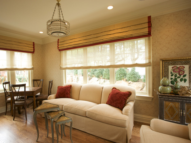
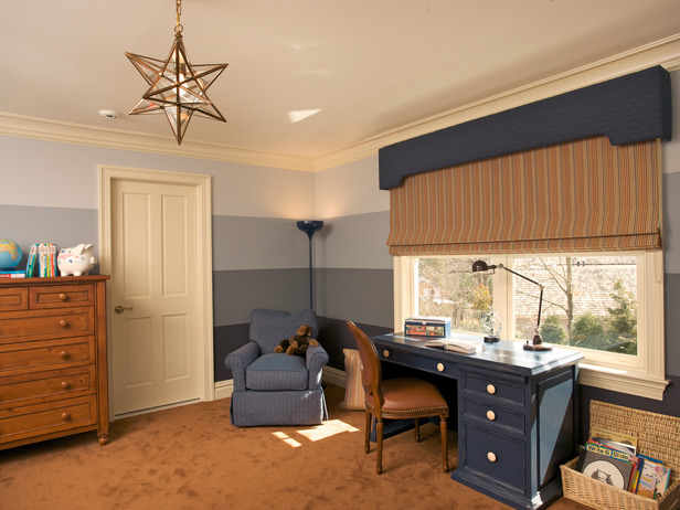
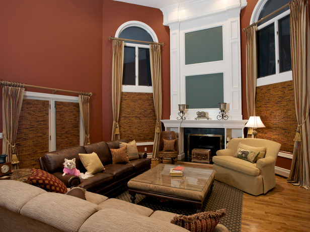
Pretty window treatments, pretty light fixture, comfy sofa. The furniture arrangement is a little wonky though. The nesting tables seem out of proportion with the bulky sofa, and the table in the corner of the room looks like a neglected afterthought. Although the wood floors are pretty, I’m dying for a rug.
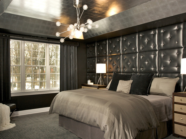
Yikes. Talk about stylistic whiplash, going from Grandpa’s media room to this coke-den-as-bedroom. This boudoir’s design says a lot about the client and I’m not sure I want to know that much about them. You just know they have video cameras installed in all four corners of the room for when it’s Sexy Time.
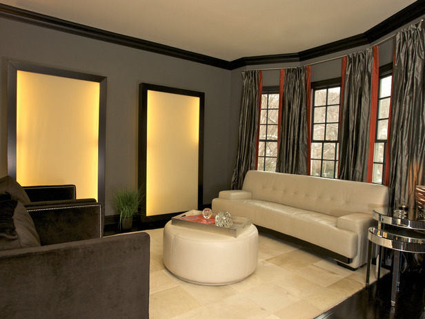
This tragic living room has to belong to the same homeowners as the bedroom above. Getting a real Tony Montana vibe.
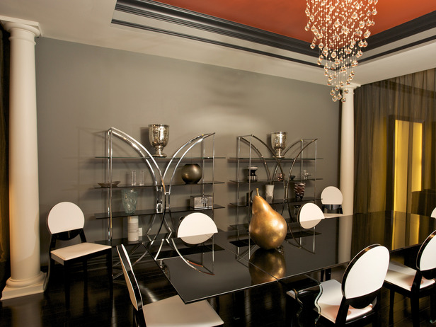
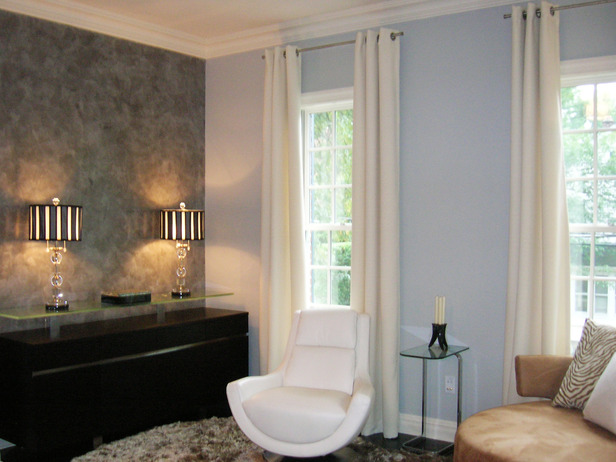
The lamps are pretty, the white chair is sort of cute, but everything feels off. Maybe it’s the gaudiness of the Venetian plaster wall, or maybe it’s the microscopic side table that is out of proportion with the other furniture. Not digging the look as a whole.
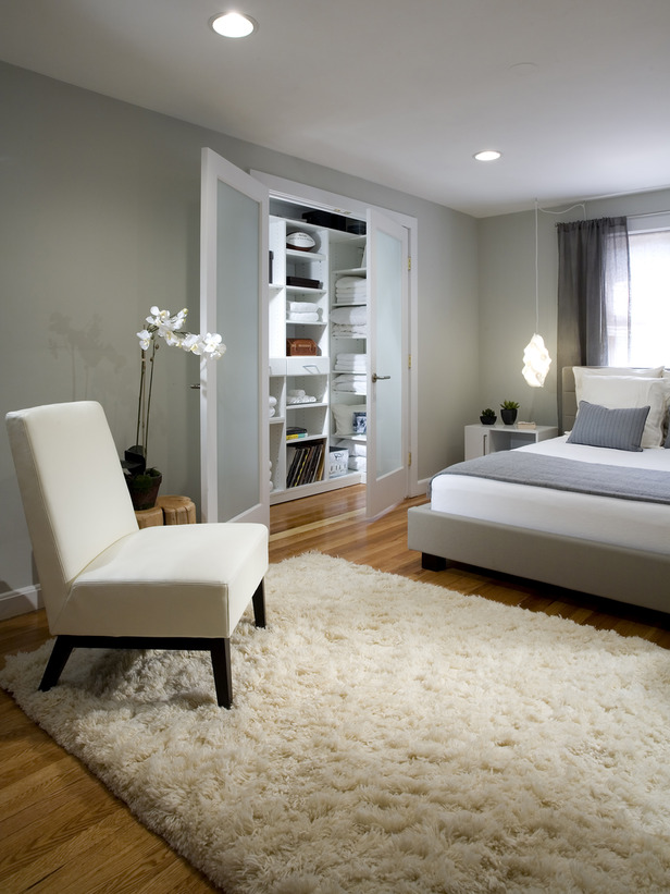
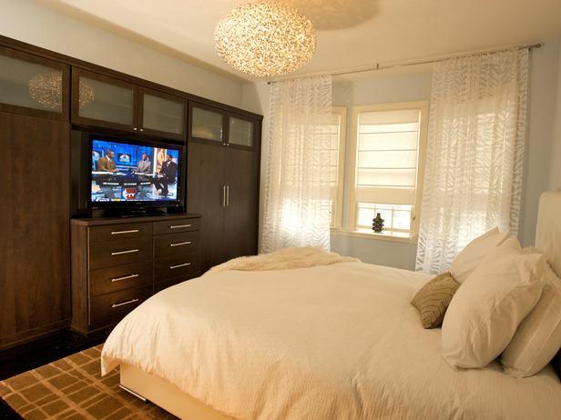
Blanche also designed the home of former New York Jets safety Kerry Rhodes, which was featured on MTV Cribs. For the most part, it’s okay but the master bedroom is cringe-inducing:
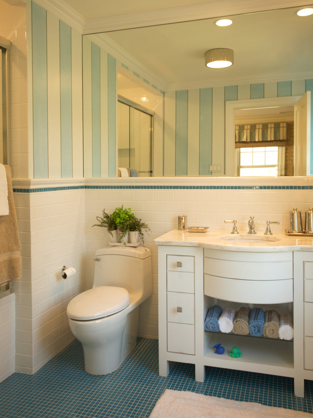
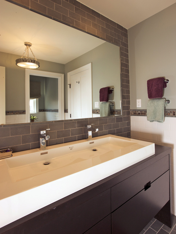
It’s still a bit more bland than I would personally go for, but it’s definitely very luxurious and spa-like.
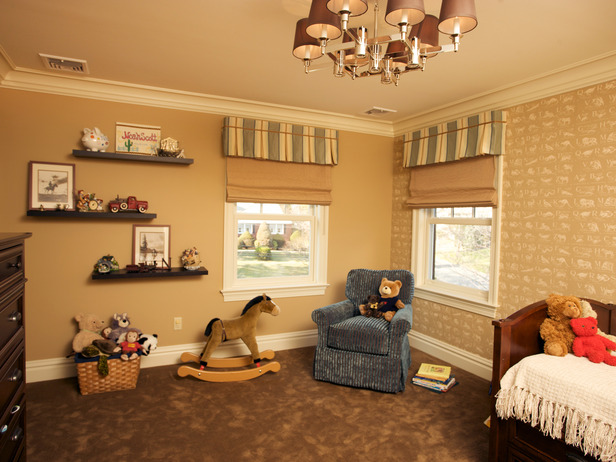
Although this nursery design looks more like the homeowner winged it themself rather than something an interior designer put together, Blanche displays an on-camera ease on another episode of Design Smarts, which bodes well for her as a Design Star competitor:
BLANCHE ON A BUMPER STICKER: Blanche’s portfolio showcases a wide range of design styles, so there’s something for everyone to like, from yuppies to playahs to the retirement set, which I assume HGTV would like. Considering her touchy-feely blog, which strikes me as having been written by someone trying to cultivate a mass audience with Oprah-style inspirational posts, and the fact that she already has an endorsement deal (with Patio Enclosures), I think Blanche might have made it to the finals.
Coming soon: I’ll check out the next contestant, Brooklynite Bret Ritter!


