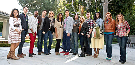
First of all, my apologies for not completing my cast critiques for all of the HGTV Design Star Season 7 finalists before the premiere episode aired. I just couldn’t cram it all in, especially in this “gap week” between the last day of school and the first day of summer day camp for my seven-year old! So we’re getting right to the premiere episode and might come back to Stanley and Yuki.
Or we may not.
FIRST IMPRESSIONS:
Luca Paganico is the first to play alpha in the group, which is not necessarily a good thing. If you have to tell everyone you’re going to beat them, you’re usually trying to convince yourself.
Stanley Palmieri forgets it’s the 21st century and shows up with an ’80s ‘do. I will undoubtedly sound like my mother here, but he looks like he’s in severe need of a shampoo.
Kris Swift appears smug. No surprise, if you view the video of him that I posted the other day. I may end up liking the work that he does on the show, but I don’t think I’m going to like him as a person.
Hilari Younger strikes me as being no drama, down-to-earth, girl next door. I like.
Jordan Capella seems flirty with Mikel. At least they’re both out, so if they become an item, we don’t have to pretend they’re just friends like Scarf Boy and Courtland Bascon in Season 5.
Mikel Welch is as cute as I expected. Quick-witted.
Bex Hale is positively radiant, full of newlywed glow and not intimidated by the group.
Britany Simon is perfectly confident. Not arrogant, but sure of herself in an appealing way. Also, still a knockout.
Yuki Northington seems out of her element, frankly.
I don’t remember anything about Danielle Colding, Miera Melba or Rachel Kate from their intro at the top of the show…can’t be a good thing.
*SPOILER ALERT* If you haven’t seen the show yet, don’t read any further, unless you embrace spoilers!

Season 7 cast digs.
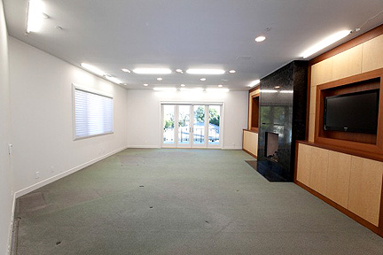
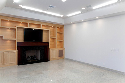
THE CHALLENGE: Design rooms in the cast house, as expected. This brings with it a very unique set of challenges, for there are oodles and oodles of dated built-ins running rampant in the house that cannot be touched. Working with all of that blonde ’80s wood is a challenge in and of itself and most of the designers don’t really do much to mesh what they do with this existing crap. I’m not saying the existing crap should be showcased, but if the new stuff isn’t integrated with the existing stuff, nothing really looks good. Although camera challenges are conducted with each of the designers (as HGTV’s photo archives suggest), this footage apparently is cut due to time constraints. Each designer was asked to provide a unique element that reflects who they are…these objects are now required to be part of the rooms they design for this first challenge.
THE ROOMS & THE TEAMS:
BEX & KRIS
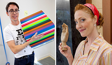
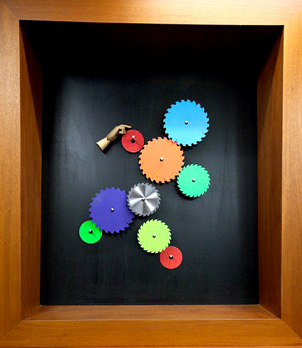
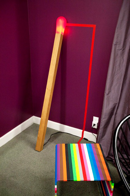
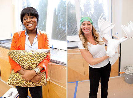
Kris has to incorporate a table he's rainbow'd, and Bex has to do something with an articulated hand she's brought.
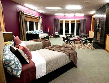
Holy steamroller, Batman! Kris runs over Bex every chance he gets during the design process. He’s one tense mother effer right out of the chute. Bex reacts the way I probably would…what the what? She’s too nice to him in response. I would end up in trouble for flipping him the bird somewhere along the way. Kris picks a saturated “passionate plum” paint for the walls, and Bex goes along. The judges hate it, so maybe it sucks in person, but I dig it onscreen.
This room is one of two that featured original art worthy of the show. Kris rainbows the fireplace mantel to match the table he has brought from home (and the bus stop bench he rainbow’d here in Austin), while Bex paints an arrangement of saw blades to coordinate with all of Kris’s rainbows. She places her unique object (a wooden hand) on the wall to suggest its fingers set the blades in motion–cute! Kris also ties his rainbow’d table to an oversized matchstick-turned-floor-lamp with a running line of red gaffer’s tape. These are the elements that really showcase their creative abilities.
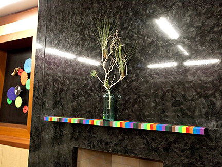
Kris's rainbow'd mantel.
There’s not really much else to brag about. Funny that this room is shaped almost identically to last season’s disastrous orange bedroom designed by Kevin Grace and Bret Ritter.
BRITANY SIMON & MIKEL WELCH
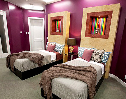
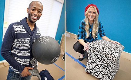
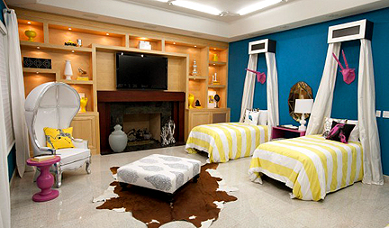
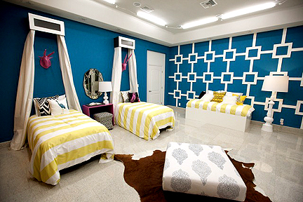
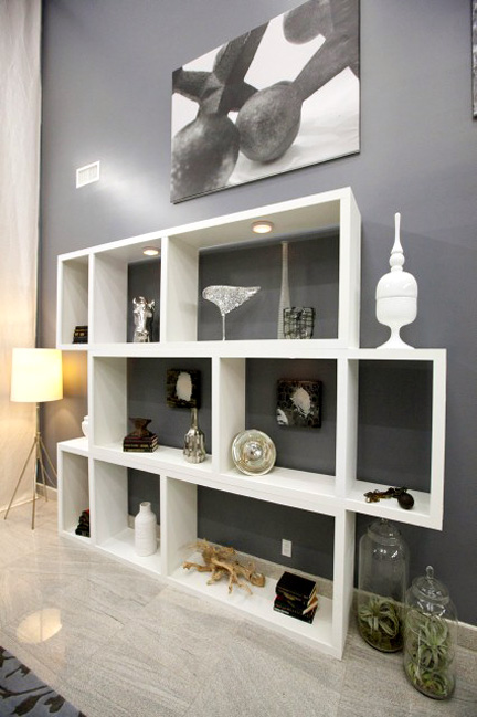
Mikel and Britany hit it off right away and get busy on this bedroom. Britany sketches out a modern lattice design for the carpenter to construct and Mikel recovers an ottoman. I would probably like the room more if there were more bold accessories displayed on the existing built-ins, in colors that reflect the rest of the room’s palette.
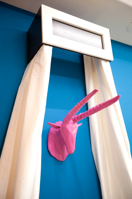
I don’t know who is responsible for the cheapo-looking bed canopies, but I’m not a fan. What’s worse, they’ve painted some faux animal trophies hot pink–a total rip off of Season 4 winner Antonio Ballatore’s signature pink geese.

Antonio Ballatore won big with these pink geese he installed on the fireplace, much to the chagrin of his teammates.
DANIELLE COLDING & LUCA PAGANICO
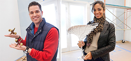
Luca's unique element: a set of oversized metal jacks (because he's a "jack of all trades." Danielle brings a winged sculpture.
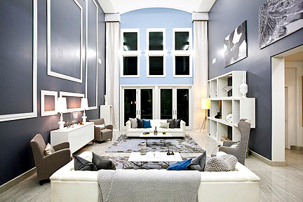
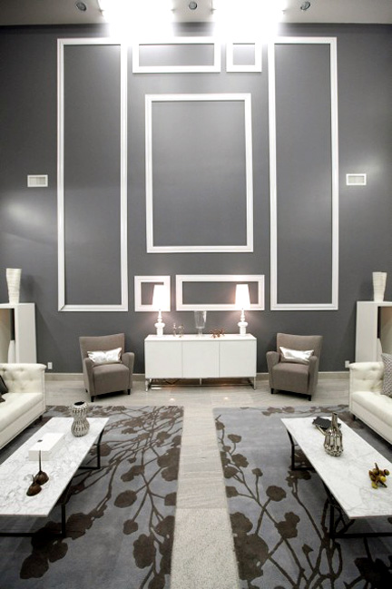
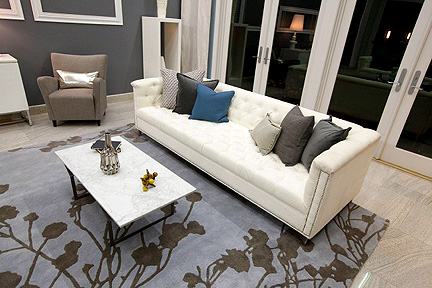
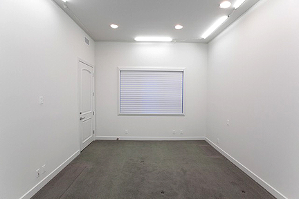
Danielle and Luca get along just fine–Danielle’s clearly psyched to get the workhorse of the bunch for a partner. She takes over the design of the space and Luca–seeing the need for someone to execute the pair’s ideas–jumps into the labor side of this endeavor. While I wouldn’t berate him for working on the construction side, I will call him out for not reigning Danielle in a little. That molding treatment she goes gangbusters on doesn’t do anything for the room except make it feel twice as gynormous and cold as it does to start with. Just look at how miniature the large sofas and the credenza appear! They look like doll furniture. Not to mention, this type of wall treatment is a dead horse of a crutch that someone insists on beating every season. Better to fill the vertical volume a different way, to create a more intimate space. Maybe that means a darker rug or darker furniture that will help ground the space. Maybe it’s a mondo DIY light fixture (or several) hanging from the ceiling and filling the upper void.
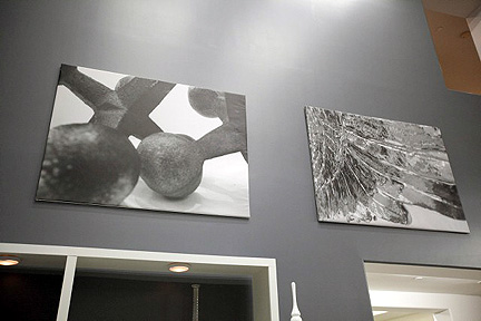
Coulda, shoulda, woulda been great as more of a focal point.
I also don’t understand why the original art the pair creates for the space is placed so high on the wall. If we hadn’t gone down this bogus molding road, we could feature these canvases more prominently in the space. They deserve to be a focal point. Missed opportunity. The baby blue paint on the window wall is a bit saccharine and the narrow curtain panels + tiny, tiny cornices are completely out of proportion to the windows. If you’re going to do this at all, at least make the curtains substantial enough to balance the large scale of the windows–otherwise they look amateurish and cheap. I’m not impressed with these two so far.
HILARI & RACHEL KATE
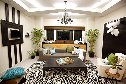
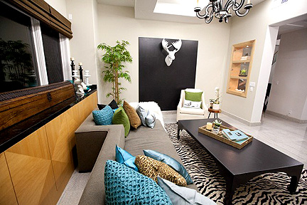
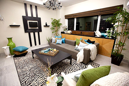
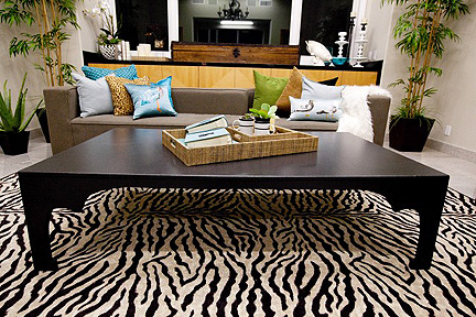
These two seem to be in sync from the start. Hilari selects the most fab sofa I’ve seen in a long time, with its inset chaise on one end. I like the ladies’ camel and turquoise pops of color, which help to integrate the existing ugly built-ins along the back wall. You gotta do something with ‘those damn things ’cause they’re out and proud. Hilari decides to create a “wall sculpture” out of molding for one wall, and mounts the world’s smallest TV inside the center. “I’m addicted to reality TV!” she explains. My husband looks at me, then looks at that TV and remarks, “I’ve had sunglasses bigger than that.” I wonder how much TV the finalists will be able to watch anyway. Rachel goes for a big black painted rectangle on the other wall, to showcase her white moose head, but the black area is too large in proportion to the wall trophy. Does no one understand how important scale and proportion are?
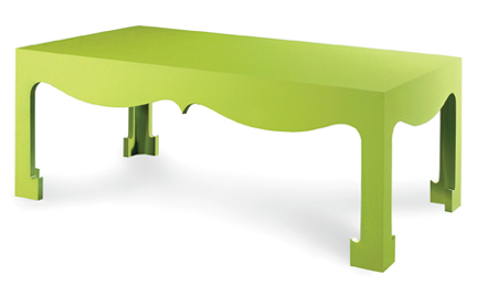
Rachel has a Bungalow 5 moment and rips off their signature table design. Then she wins top honors for doing so. Bungalow 5 has had their work splashed all over a bazillion design blogs and shelter mags–it seems unlikely that the judges have never seen this table design before. C’mon, judges. This isn’t Rip-Off Star.
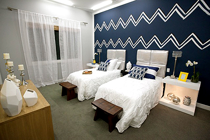
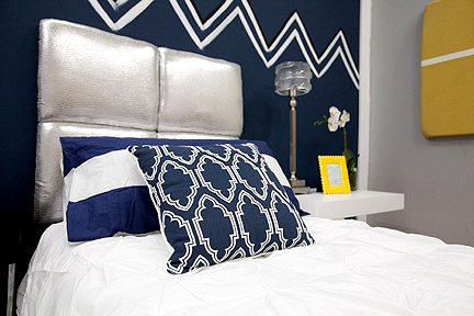
Miera takes the prize for ugliest “unique element” and I struggle to give her a pass because she’s from The Netherlands so Delft ceramics do say something about her. Jordan starts the ball rolling by selecting a metallic crock for upholstered headboards, then gasps in dismay when it turns out this fabric is not on a conventional 54″ bolt–it comes in the form of small hides. He rises to the challenge, changing the headboard design on the fly to feature four upholstered sections rather than one large piece per bed. Good save! The headboards turn out looking great and I love this color palette.
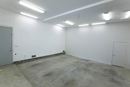
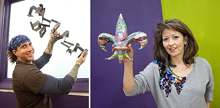
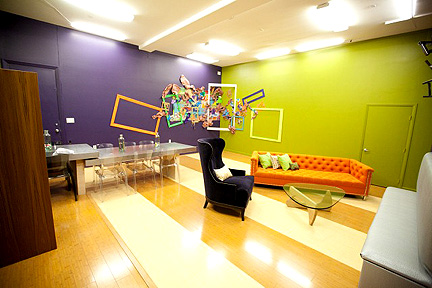
Before the episode airs, Stanley and Yuki are my picks to go home early in the competition, so it seems like bad foreshadowing for them to be assigned to the same room. Yuki selects the wall paint, and while I wholeheartedly support bold colors, I don’t see how the garish lime and purple shades will foster creativity in what is supposed to be the designers’ studio. That intense green will reflect its color into the workspace, making it difficult to judge paint color or textiles effectively. I don’t know how much the designers will actually work in this space, so maybe it’s a moot point, but if it weren’t for the superfab orange couch (which I covet), I can’t imagine ever setting foot in this room.
I think it’s funny that the rest of the designers are fighting ugly built-ins featuring outdated wood tones and Yuki voluntarily brings those same shades into this space. The seating area is desperate to be defined with a rug–floating out in nowhereland makes these interesting elements feel cast about without rhyme or reason. The multi-level desks are an interesting solution. The strange banquette on the right-hand side? Not so much.
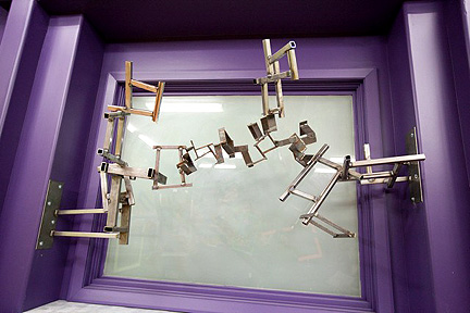
It’s cool to see the producers provide Stanley with welding equipment so he can do what he’s good at. Not that I’m so in love with his sculpture, but considering reports from previous seasons that even cameras weren’t available for creating custom art, it’s great that they’re opening up more creative opportunities since copyright issues and new rules concerning product placement prevent the designers from using any purchased artwork. Stanley doesn’t seem to do much in terms of design in the space, other than enlarge his existing sculpture. I don’t see a lot of there there.
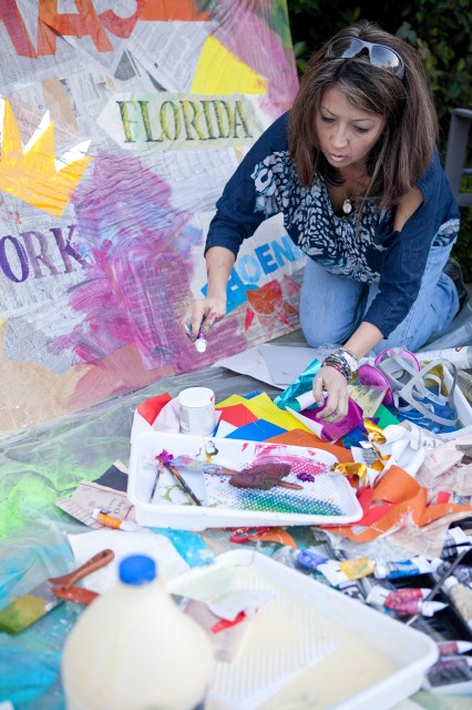
In the end, the judges send Yuki back home to Bay Saint Louis, Mississippi, and her shop, Social Chair. In a room where nearly everything goes wrong, her collage is the final straw.
HGTV’s Design Star airs Tuesday nights at 8:00 CST. We’ll be doing episodic critiques and an occasional surprise here on Fu For Thought throughout the season, so check in following the show and tell us what you think of the designers and their work!

