Things I never expect to write about on my blog:
1. The Effing Kardashians
2. Intentional Use of 1970’s-Style Arched Windows
3. How Much I Loathe an Austin Designer
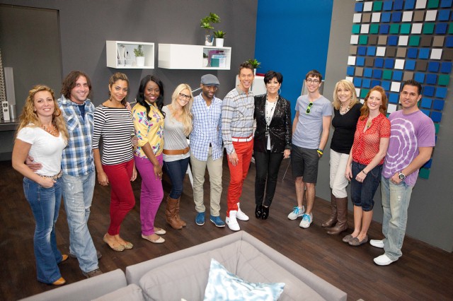
This week’s episode of Design Star revolves around creating new office space for media moguls, the Kardashians (Jenner Communications). First, let me say how unlikely it is that this notoriously wealthy family will ever set foot in this office space. It’s just too tiny and does not appear to adequately project the cache of their family’s brand. I have a hard time believing that with their gazillions, they can’t afford a larger office with more windows, although apparently they would rather have mirrors than windows any day of the week. With all of the mirrors and the tiny spaces, how will they really be able to tape their many reality shows? I’m just not buying it. This has the faker taint all over it.
For the most part, the designs created for this hour-long Kardashian commercial are cohesive. Everyone gets the message when Kris Jenner says she LOVES black and white. No one is out of step on that score–that theme is running throughout the place, helping all of these disparate rooms created by so many different designers relate to each other. That part’s great.
Once again, I’m not in agreement with the judges on who should win “best designer” this challenge, but don’t take that to mean I’m on some kind of Stanley-bashing rant this week. I would rank the rooms as follows:
BRITANY SIMON & MIKEL WELCH
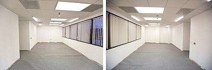
BEFORE: The conference room.
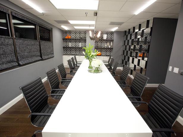
AFTER: Britany and Mikel create a stunning conference room.
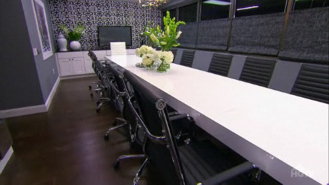
All of the selections and styling in this conference room are perfection.
Talk about knocking it out of the park. This room is flawless, as in NO FLAWS WHATSOEVER. I would probably have to go back to Season 3 to find another room I can say that about (nod of respect to Matt Locke and Mikey Verdugo and the amazing bedroom they designed for the cast house). Love the wallpaper, love the 3D mirror wall, the floral arrangements, the orange zing of accessories, the window treatments, and gawd, do I LOVE Britany’s glasses:

Britany Simon and Mikel Welch work together to makeover a conference room.
Every time I see Britany on camera, I like her more. She’s flying under the radar (at least the show’s editing makes it appear that she is), leading me to believe she’ll still be around for the finale. Good. Mikel is still adorable and appears even-keeled. As much as I like him, he’s not necessarily coming across as authoritative.
DANIELLE COLDING & HILARI YOUNGER
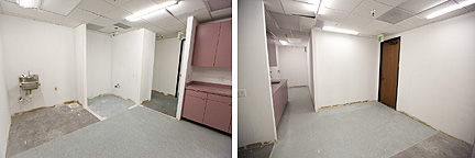
BEFORE: The kitchen.
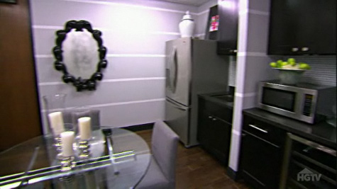
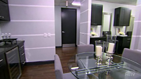
AFTER: The kitchen designed by Danielle Colding and Hilari Younger.
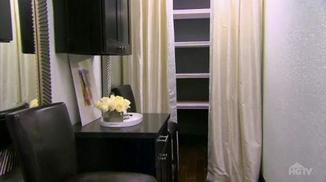
AFTER: A view of the curtained PR closet.
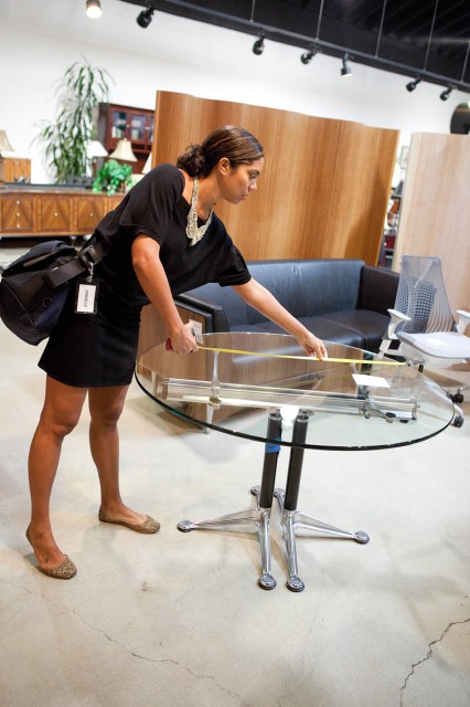
Danielle Colding makes an odd table selection.
The kitchen and “beauty bar” these ladies design is pretty polished for the most part. It’s hard to find a more appropriate use of the bling-ed out wallpaper Hilari selects–that’s just tailor-made for this project. I’m cracking up that the designers themselves are installing the wallpaper around the PR closet’s “wing walls” themselves. It comes out disastrous and has to be ripped out. With all of the bumpy texture on this stuff, I wouldn’t know the first clue as to how to apply it and get all of the air/wrinkles out, so I can’t fault them for effing that up. The curtains they install are a pretty good save. The judges are right, the accessories are a bit cheap and forgettable. I would love to see some color in the space–one red magazine cover in a cheap frame doesn’t really cut it. The bistro table they’re all digging? Hate it. There’s nothing glam about it–it screams chrome-and-glass-bachelor-pad.
On the personal side, I love seeing how Danielle and Hilari work together. Even when Danielle jacks up the wing walls, you see the worry on Hilari’s face, but does she blow up at Danielle? No. She hugs her. Bravo! If Miera had crinkled up Kris’s wallpaper in the reception area, do you think he would have reacted this way? If Bex had wrecked Luca’s island in some way, would he have hugged her? Hell to the no, on both counts.
KRIS SWIFT & MIERA MELBA
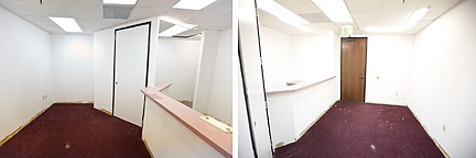
BEFORE: The reception area.
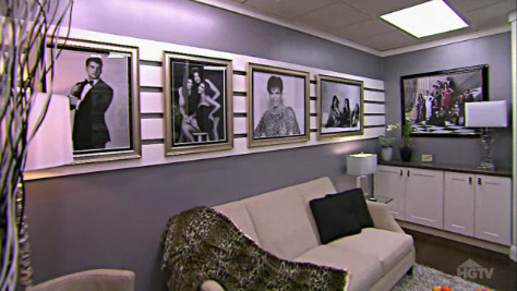
AFTER: Miera Melba's photo wall in the reception area.
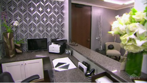
AFTER: The wallpaper selected by Kris Swift.
It doesn’t take an expert sociologist to predict this pairing is doomed from the get-go. Kris doesn’t have one ounce of flexibility or compromise in his entire makeup, and he sure as hell doesn’t have any respect for anyone. How I loathe narcissistic people. Dude has to be one of the weasliest finalists to ever appear on this show, and you know that’s saying a lot. The starf*cker drips his smarminess all over Kris Jenner during their one-on-one brief and when Miera calls him out for bogarting the convo, he doesn’t get it. “I think Miera is frustrated,” he says, “because Kris (Jenner) and I have communicated so well together.” Pardon me while I hurl. Later on at the wallpaper store, Kris shows his disrespect again when Miera doesn’t snap-to when he asks her to look at something. “I need you to focus over here, Miera,” he complains. Miera’s the last person lacking focus on this show. In fact, I would say that most of the designers left are a pretty focused bunch, so this smirky little petulant comment of his is just a lame attempt to make his partner look bad. If you have to make someone else look bad to make yourself look good, how good are you? Please get this little prick off my teevee and send him back to Canada, because we sure as hell don’t want him in Austin.
As for their reception area’s design, I do like Kris’s wallpaper selection, and the black and white photos are a natural for art. I could take or leave the wood strips behind the photos, but Miera has to do something she can claim ownership of in the space. The beige furniture is bland and doesn’t really gel with the color palette. The fake fur leopard throw is so cheap-looking, I can’t imagine incorporating it into the space with a straight face. If they’d brought in some bright color, the reception would make more of an impression.
BEX HALE & LUCA PAGANICO
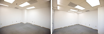
BEFORE: The showroom.
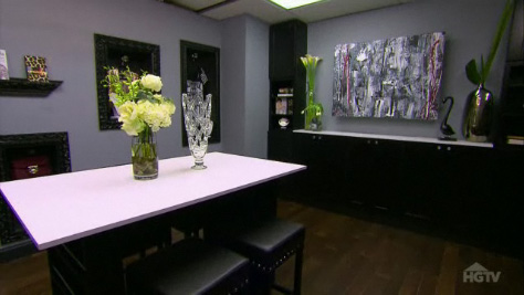
AFTER: The showroom, with its many vases and masculine painting by Luca Paganico.
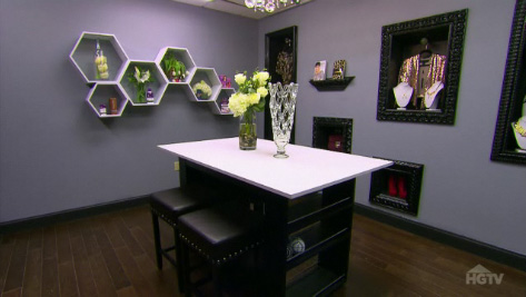
AFTER: Hive wall shelves arranged by Bex Hale.
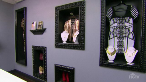
AFTER: Framed boxes display some of the Kardashians' licensed merchandise.
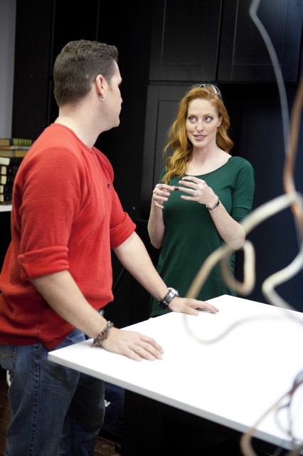
Bex and Luca feign a friendship to get through their camera challenge.
A showroom implies a much bigger space than what is allocated to this room, especially considering the licensing juggernaut this family happens to be. This is just another reason I think the whole challenge is trumped up, but whatever, let’s play along. I like the idea of Bex’s framed out display boxes, similar to the stuff I raved about locally at Finch, but wish the boxes were lit. The geometry of the hive shelves don’t really relate to anything else in the space, and with mere minutes to accessorize, it’s no wonder they turn out lackluster. Given Bex’s experience with her own 12,000-square foot retail showroom, Luca would be wise to defer to her where accessories are concerned–especially considering how his white room turned out in the last episode–but instead, he turns whiney. While shopping, he picks up a glass vase he wants to get and Bex shoots it down. “You’re not letting me shine!” Luca wails. Dude, if you think that one glass vase is gonna make you shine, I don’t know why you are here. What I don’t get is that Luca is constructing an island. Luca is creating a painting for the space. Where’s the lack of opportunity to shine, Luca? And now that we’re on the subject of the painting, when Luca is shown bent over a canvas with paintbrush in hand, I think we’re finally going to see some of his real talent. But no. It’s just a big, masculine mish-mash that doesn’t do anything for what should be a very feminine space. The judges are right, in part, to suggest that the wall would be better served showcasing Kardashian products rather than art, but I’ll bet you dollars to donuts that if the art had been spectacular, the judges wouldn’t be critical. I crack up when Luca says, “Kris Jenner was great. I just felt like I’m where I should be–with the elite.” Are you serious, Luca? Who utters crap like that? I am glad to see Luca go, but I’m shocked that Bex is sent packing this week. Shame.
RACHEL KATE & STANLEY PALMIERI
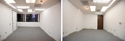
BEFORE: The office.
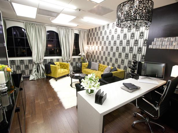
AFTER: Abysmal arches and ridiculous curtains coordinate with dated-looking wallpaper.
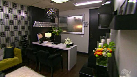
AFTER: The desk and "tennis bracelet" wall art designed by Stanley Palmieri.
Yes, I think Kris Jenner’s office is the worst room in the bunch. Why? The wallpaper looks like it comes from the tacky side of the ’70s, and those gawd-awful, outdated arches don’t help matters. Add the billow-y curtains and it’s just damned fugly. What’s the point of creating the arches in the first place if you’re just going to cover that detail with voluminous curtains? The acid green seating is a total win, but that’s the only thing on this side of the room that works. Stanley’s “tennis bracelet” on the wall is kind of cool, but not winning cool. I am warming to his personality, though, and the desk he designs looks good.
Based solely on this challenge, I would send Rachel home for her outdated arches–it’s just criminal to voluntarily make the room look antiquated. (I also assume she’s responsible for the wallpaper and icky curtains in her room.) For the second elimination, I’d pick Luca. He doesn’t really seem to understand design or styling, both of which are necessary if you’re hosting your own decorating show. So is an appealing personality, Kris. Your smug mug will undoubtedly be wiped off your TV in the evaluation studio too, and hopefully that day is coming very soon.
HGTV’s Design Star airs Tuesday nights at 8:00 CST. We’ll continue to do episodic critiques here on Fu For Thought throughout the season, so check in following the show and tell us what you think of the designers and their work!
