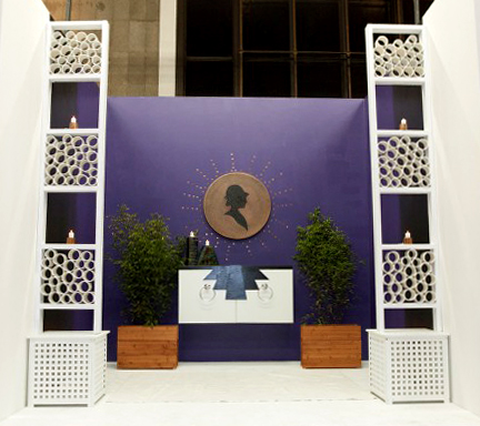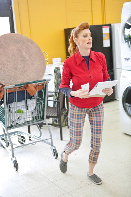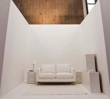
The iconic White Room Challenge is the one episode Design Star fans all know is coming. Like Top Chef‘s Restaurant Wars, this is the ultimate challenge. Designtestants can practice for it, but they can never quite anticipate all of the parameters involved. The key element is trying to figure out what random store you’ll be shopping in. Previous seasons’ competitors have been required to shop in pet stores, army surplus stores, restaurant supply stores, an Asian market…places unrelated to home decor.
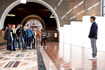
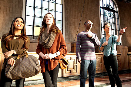
This year the challenge is held inside Union Station, right out in public for the first time.
The producers get REALLY crazy and force the designers to shop in…
…wait for it…
…
…
…a home improvement and garden store.
BAM!
Ooooh, freaky! How will the designers EVER figure out what to do with building materials and real plants? You crazy, crazy producers. Surely that’ll just be soooooo haaaaaard!
Are you effing kidding me? Talk about anti-climax. They must be saving the creative locations for the DS spinoff show, White Room Challenge. Yeesh.
Despite this gilded gift, some designers manage to fug things up royally. But let’s start with the good stuff. I’ll rank them from best to worst, IMO:
RACHEL KATE
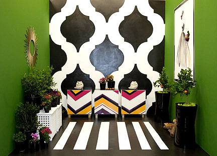
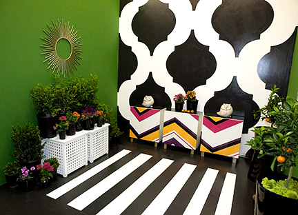
All week, I’ve assumed while watching the episode promos that this bold design featuring a black and white trellis backdrop and chevron-painted furniture was Britany Simon’s work. It was a bit of a shock to see it turn out to be Rachel’s. I love the room, although I agree with the judges that the cement owls and the plant stand on the left side of the space are pretty lame. Gawd, those owls are so Ace Hardware. A little spray paint could do the trick, but since the Moroccan pattern and the chevron cabinets are so commanding, the owls and plant stand are strictly peripheral for me anyway.
Rachel’s room is very C. Wonder (any fans of The Pitch out there?), with its Kelly green walls evoking the retailer’s signature doors and the rest of her room mimicking the black and white patterns and bold colors found within the store. And here we go with another freehand pattern painter–pretty impressive! I am pleasantly surprised by how well Rachel does on camera. As I suspected, she reminds me a lot of old school HGTV personalities from Minneapolis, like Joan Steffend from Decorating Cents. The trouble is, Rachel’s room is much more memorable than Rachel herself is. At the end of the episode, when Claire and I talk about our changing impressions of the cast members, there are a couple of people we can’t think of, and Rachel is one of them. She needs something bold about her. Otherwise, she’ll struggle to develop a viewership. Rachel wins this challenge, so she’s two for two this season.
DANIELLE COLDING
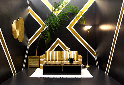
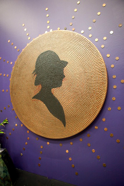
Despite Danielle’s chagrin at the top of the show, she comes through this challenge with (mostly) flying colors. Inspired by a similar element in her childhood digs, she creates a striking graphic pattern on the walls using black, gold and white. The pattern is slightly off-center, which the judges assume is a deliberate act. Claire, Jeb, and I aren’t so sure this off-centeredness is on purpose, based on the fact that it’s not obvious enough to make it look intentionally asymmetrical. I’d put money on it being a happy accident. Danielle tapes stripes on her couch and paints it gold. When she carries it back into the space, I’m digging the way the tape now appears glossy gold against the matte sofa fabric. When she rips the tape off to reveal white stripes, I’m disappointed. The white stripes do coordinate with the background graphic, but the matte/glossy combo is way hawt. Danielle creates art out of precut plywood circles and that fills the negative space pretty effectively. The judges give her heat for an ugly torchiere lamp. She needs height on that side of the space, so I understand why she includes it, but it’s a shame she doesn’t transform it into something more interesting. It would probably look infinitely better with the glass shade removed and a bare bulb.
BRITANY SIMON
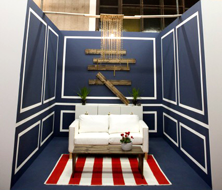
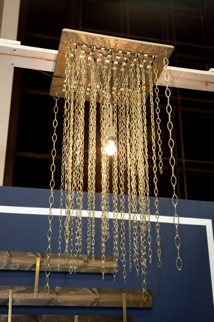
Girl makes a FANTASTIC chandelier this week, out of gold chain link. LOVE. Talk about something that would werk in real life. She ought to figure out some way to manufacture that. The gold thumbtack nail head trim on her sofa is a nice, resourceful touch, and I like the navy wall color with the gold accents. But here again we’re stuck looking at another molding treatment. Whether it’s real or faux, I hope to never see this type of thing on Design Star again. It’s pretty and certainly light years better-looking than Danielle Colding and Luca Paganico’s molding treatment in the last episode, but it’s been done to death on TV, people. Move on. Reinvent it. Make it weird or special in some way.
BEX HALE
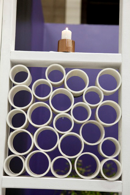
For the second episode in a row, Bex plays around with saw blades, and thank gawd she comes out of this one with all of her limbs and appendages intact. Phew! The way her hands and fingers dance around that whirring saw blade, I’m bracing for a Dan-Aykroyd-as-Julia-Child-SNL moment, with blood gushing everywhere. “It’s only a flesh wound!” Bex would say gaily, then she’d craft roses out of her severed fingers. Bex seems to have a lot of talents, but cutting PVC pipe with a chop saw is not one of them. Luca finally steps in and drags her away from the machinery before the show turns into an episode of ER. I wonder if some industrial-strength velcro straps could hold that pipe in place on the table? Wielding 8-foot PVC around the chop saw isn’t going to work out to the extent Bex originally plans, but she is able to change her tactic and create two screens with the pile of rings she’s already cut, and the screens come out looking really fun and interesting.
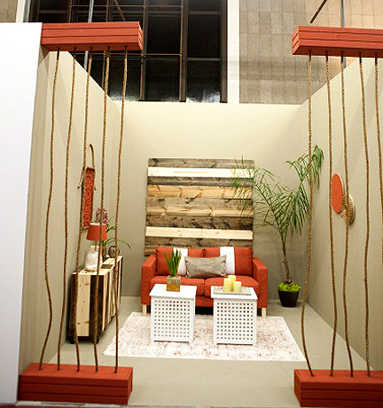
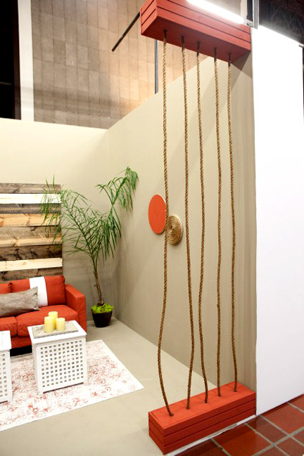
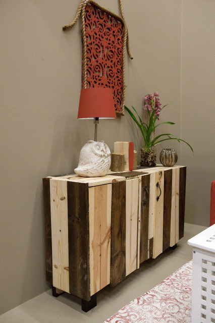
The wood plank wall treatment is pretty cool too, though off-center–and not in an accidentally fabulous way. The color palette works, there are hits of red and wood grain in all the right places. Judge Genevieve Gorder writes this room off as just “a room with a couch.” Personally, I don’t know why that criticism applies to Mikel’s room and not also to Danielle’s, Miera’s, Luca’s, or Britany’s rooms. They’re all rooms with a couch. What’s the big deal?
STANLEY PALMIERI
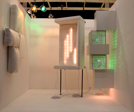
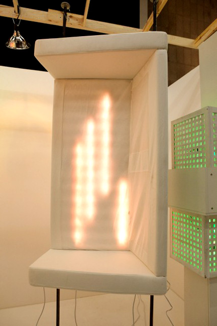
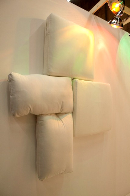
I know the judges (and maybe you) just loooooove Stanley’s room. I like Stanley’s room but I don’t think he’s pushed it far enough. An upturned couch, four cushions on a wall and a few lights thrown around just doesn’t look like the amount of effort befitting this challenge.
I’ll give him props for boldly going where no one has ever gone before (and for likely being the inspiration for a recent episode of White Room Challenge, where the contestants had to create a room with light and shadow), but it’s not enough for me to put him in the top three, as the judges have. If avant garde art is Stanley’s specialty, I just don’t see how you turn that into a show. At least, not on this network. Not for nothing, but I just don’t think they can turn this dirty-haired metal man into a Design Star–especially unlikely considering his botched and boring camera challenge. After seeing this footage, I wonder how Stanley made it onto the cast to begin with. Where’s the star power?
MIERA MELBA
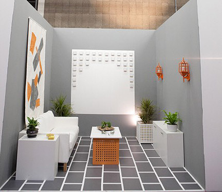
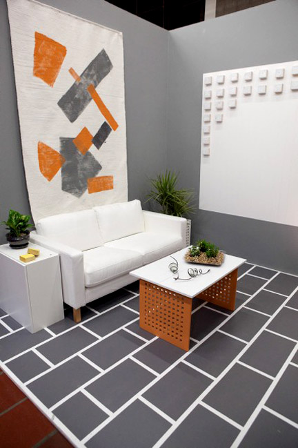
Miera starts out trying to glue wood blocks to her focal wall, which as you can probably guess, doesn’t really go anywhere. I can’t imagine a universe where glue is the first line of defense for this project, but after a bit of fumbling with the glue and falling wood blocks, Miera switches to tools and fumbles with a drill and screws. The number of people on this show with no DIY skills cracks me up. Miera finally gets her white blocks affixed to her white square and it’s okay but not terribly revolutionary. Distressed wood blocks might be more interesting–or paint an odd one or two for interest. Miera quickly rolls paint in an abstract design onto a white woven rug and hangs it above the sofa. It’s not high art but it does bring some much-needed impact into the space. I wish she’d use this as the focal wall instead of it being partially obscured on the left wall.
I agree with Jordan that I don’t think his is the worst room. There are three rooms that suck more than his. His room’s not a trophy winner by any stretch, but it doesn’t lack visual interest. He definitely suffers in the transformation department, leading Britany to ask her bud, “did you go turn your coffee table into a coffee table yet?” The thing is, his room might not be the most creative, but I still want to watch Jordan. Genevieve’s right, he is charming. He has enough talent that I anticipate better things from him in the future, whereas there are others in the competition I can’t say that about. Claire and I are SHOCKED that he’s sent packing this episode. Dude, you are SO ROBBED. What does Luca do that was any better in comparison?
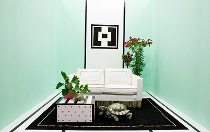
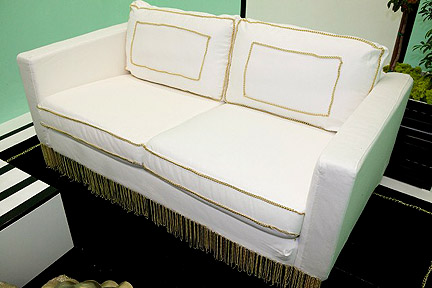
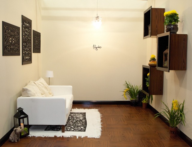
Woa. Out of all of the cast members, I would never imagine Hilari without DIY skills, but she freely admits she has nightmares about power tools and doesn’t know the first thing about executing her ideas. Too bad there’s not a carpenter provided during this challenge. Why is that, anyway? The designers on WRC get carpentry assistance. Hilari starts out with an interesting idea to use lengths of rubber hose to cover her coffee table, but can’t figure out how to adhere the hose to the table. Maybe if she had lashed them together, they would be easier to pin down. Either that or a hammer and nails, people. Hilari trims out her couch with gold chain and that’s okay but it doesn’t exactly make the room pop for me.
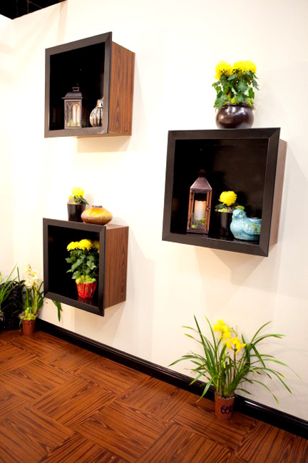
The room’s mint color is mildly nauseating and there’s too much of it. The only art is a small black stencil above the couch. Claire and I wonder why she’s obsessed with little squares on the wall. “I know,” mocks Claire. “I’ll put a tiny box inside another tiny box!” That seems to be a recurring theme for Hilari. I hope that changes next week because I’m not ready to see her go home!
Also…turtles?
Luca, the ’80s called and they want their lifeless dorm room back. Oh em gee, this effort is boring as hell. I’ll grant him one cool light fixture and fun signature but good gawd I would slit my wrists if I had to live in a space like this. Builder beige paint on the walls? Brown accents? Cheapo old lady junk on display?
To quote judge Vern Yip, Luca’s room is WHORE-end-us. Vern keeps chanting over and over. WHORE-end-us, WHORE-end-us, as if he is calling on some hooker goddess to put him out of his misery. Where is your artistic talent, Luca? Where is the drama? You can’t just play the Val Kilmer stand-in in the evaluation studio and expect that to keep you going in this competition. During the construction phase, David asks Luca, “I see a lot of projects here, but what is your concept?” Luca says he doesn’t think design requires a concept. I wouldn’t say you have to have a theme, per se, but you do need a damn clue. Dude is spiraling into the bottom, lickety-split.
KRIS SWIFT
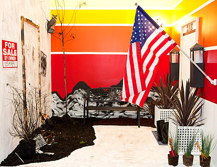
Now let’s watch Chernobyl Diaries…er, Kris’s white box design. Looks like what you’d get if Tuesday Adams was your interior designer. Why all the death and destruction, Kris? What happened to your happy rainbows? Good grief, dude, you’re trying to get an effing decorating show on the most Polyanna of all networks! Kris’s inspiration for his room is the wildflowers the Austin area is known for, thanks to Ladybird Johnson’s efforts to beautify our area. At least Claire and I think he’s saying “wildflowers,” which gives us all kinds of consternation trying to connect the dots between this charcoal madness and our gorgeous bluebonnets. It isn’t until I watch again with Jeb that I realize Kris’s inspiration is not wildflowers, but the wildfires that destroyed so many homes and beloved timbers in Bastrop last year. As Emily Litella (Gilda Radner, circa late ’70s) used to say, “That’s very different.” But it’s still not attractive. It’s depressing and ugly and as painful to look at as Kris’s smarmy camera challenge. Geebus, pass the Xanax.
Even Bromstad is like, “Dude. No.”
There’s a time and a place for this type of homage, but Design Star is neither the time or the place. It would be more appropriate to commemorate this event at Kris’s downtown Austin Adopt-a-Stop.


